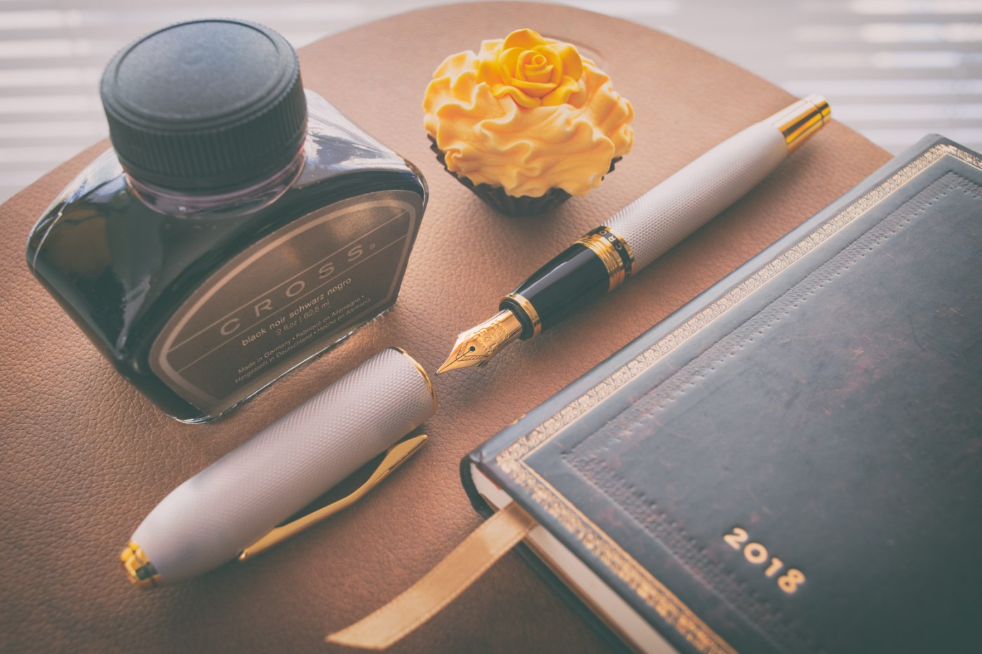
This pen was a Christmas gift from my girlfriend – very cute – both, my girlfriend as well as her gift. Ok, I go no further – no need to bore you to death. The pen I want to introduce you today is the Cross Peerless 125 Platinum Medalist. It was on sale at Appelboompennen and quite cheap back then.
It is my first fountain pen from this company since I am nowadays a bit focused on european brands and hence neglecting all those from Japan or the US. I don´t know entirely why. A part of the reason was, however, one of my first a bit more expensive fountain pens was the Sailor 1911 (see review on this blog), which I was not dissapointed of, but I found myself not using it so often due to its Zoom-nib which was an experiment that sort of failed. A Platinum President which came much later was also not that satisfying. What has this to do with Cross? Well, not much, but my mentioned focus on european brands had its influence – with the european brands I am always satisfied. It comes in Addition, actually, that the nib and feed of this fountain pen is produced by Sailor
Anyway, back to the choice of a Cross-pen: When I was checking the webpages of fountain pen shops, I was recalling my time when I used to be a “young” schoolboy as I got one of the super-slim ballpens from Cross together with a retractable pencil. I found the tapered shape super stylish and the slimness, although absolutely unergonomic for my hands, I found somewhat exalted or extraordinary. And nowadays I found the design which had not changed over time again quite special. OK, the not changing design is not very new and not restricted to cross, neither. Obviously the fountain pen companies keep their design over decades – especially if the design ist somewhat “iconic” (I realize actually, that this is the reason why it is called iconic). Well, when I saw the offers of the abovementioned seller I immediately refreshed my memories from the old pens I used when I was in school. I browsed then through the sales of the Cross-pens with the focus on fountain pens, because ball pens I am not interested in at all, anymore (no, this is not an expression of elitism). And I found quite quickly this pen, the Cross Peerless 125 Platinum Medalist. Main reason: it is a girthy pen – far, far away from the slim pens I had once – and which are still available. I was tempted a bit from the Star-Wars-series Cross offers, but actually not too much. They are a bit above my budget (I didn´t know to that time that somebody else eagerly wanted to cover the expenses) and I don´t like the hype, and yes, commerce, around the new Star Wars films (neither back then when the first films came out, by the way; but that is not part of this introduction). Back to topic: The option of the gold-plated iversion I found too much over the top and the black issue I found and still find too boring. Not in general, but I have too much black pens (old ones and new ones) with platinum or gold trims. The Peerless platinum plated was my pen of choice because the color-scheme shows elegance combined with sort of understatement. It is just not pretentious but not boring, either.

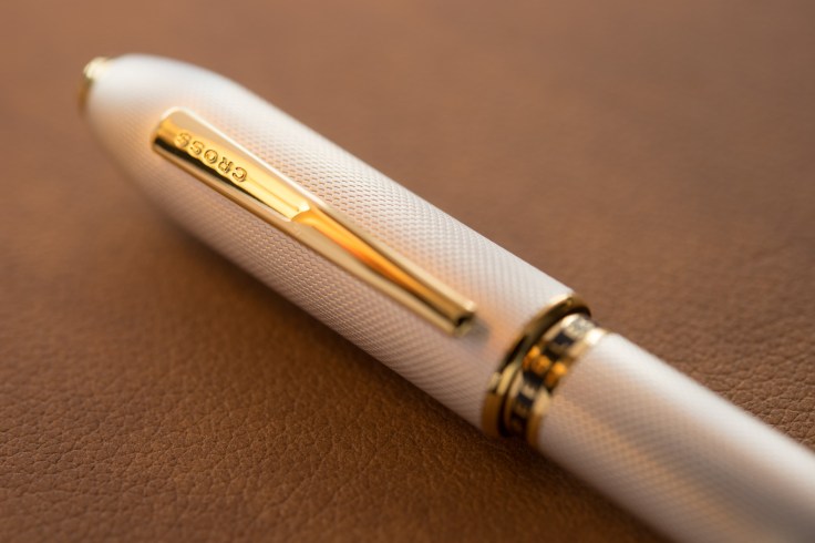
The pen features a guilloched, matted silvergrey cap and barrel. Here, I must admit, that I am not completely sure whether this term is correctly chosen. Neither do I have a clue how this pattern (the “guilloche”) was made (etching or engraving). The cap is quite thick compared to the barrel and most of all to the bottom part of the barrel. Actually, it looks a bit unproportionated in a way. Uncapped, however, the pen looks balanced in that matter. So, it is acceptable for me. The section is of black, shiny plastic. The finnial as well as the endpart of the barrel (which gives the impression of a twisting turning knob for the actually non-existing piston) and the clip are of goldplated metal (only the clip is obviously of steel, since it is magnetic). The cap-threads which go over into a ring seperating the section and the barrel, is of the same material and plating. The mentioned ring says in capitals “Cross Peerless 125” with golden letters on a black (plastic) background. The section is finalized with a goldplated ring. The finnial and the fake-endcap have a thin milled ring with black color – a quite nice detail, I find! The cap ends also with a goldplated ring. Also it shows on its very top (the finnial) a very dark gem from Svarowski. Here, I would wish a bit more colorfull or more translucent gem because as it is now it just looks like a black, facetted something – not very appealing at al. But this is may be just me. The quite tight clip is typically (for Cross that is) curved and carries the imprint of the company logo. And here I am a bit surprised: all the fotos from this pen I found in the internet show the logo as gold lettered on a black background, my exemplar has an embossed logo – strange. May be I have a fake version? Nah, probably not.

The pen is – as mentioned earlyer – not a piston pen but a cartridge/converter pen. The converter has threads to screw it into the section. It looks proprietary and not “standard international” (I don´t own cartridges).
The “heart” of the pen is an 18 karat gold nib of size 6 – comparable of the Meisterstück 146, Pelikan M800 or – more evidently – of the Sailor 1911 large. And why is it evident? Because nib and feed look like those from the Sailor. And also, because I red in internet forums that both are produced by Sailor.
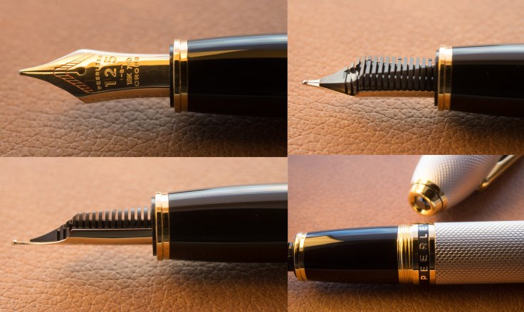
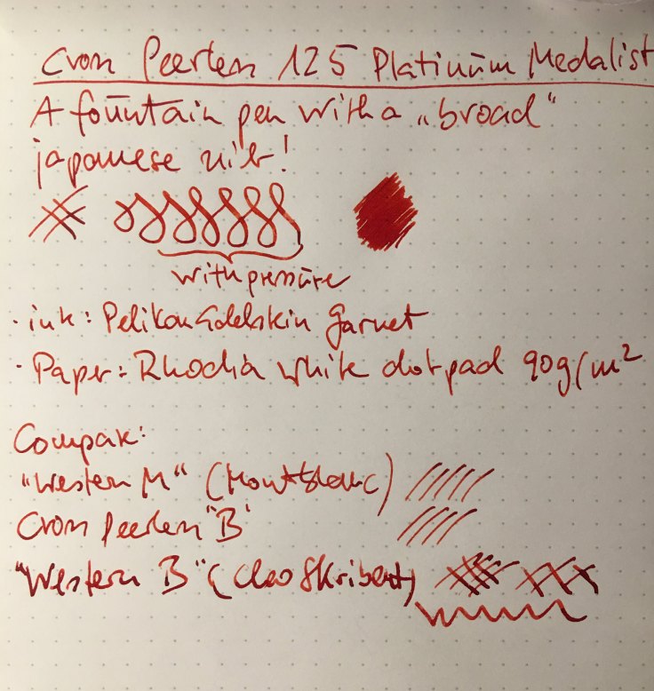
Nothing wrong with it – quite the opposite, in terms of writing experience. Only in terms of the width of the nib … it says “B” (it also says from front to rear: “PEERLESS/125/-B-/18K 750/CROSS” – the slashes indicate a new line) but it writes like a thin M or a slightly broader F. So be aware! You buy an american pen with a japanese understanding of nib grades.
I am not a big fan of demonstrating or describing the writing experience with a standard nib in an individual fountain pen. According to my experience the variability from nib to nib (even from the same grade – not to mention from the same brand or model) is to strong and dependent upon the exemplar I hold in my hands. Softness, flexness and wettness. And it is quite subjective and about personal preference. What I can say about the purchased item is anyway that it writes quite smooth and wett – exactly as I like it. Overall I am a bit reconciled with japanese nibs (after the – only for me(!) disapointing Zoom-nib from Sailor and the nail of a nib from Platinum). This nib is quite soft (actually the same softness of a Montblanc 146 or M800 nib), but of course not at all springy (I mean flex). For me it is a good supplement to my otherwise medium to broad nibs which I prefer, otherwise
The cut offers no stubbish character, though. But this is not a big surprise in modern thin nibs – according to my not too high experience, that is.
What makes the pen literally “peerless”? Well, actually nothing … It compares quite well with other fountain pens in this price range. For me, it is the shape or the design which makes it a bit more special in my pen collection. Overall, it is not fancy at all, but due to its material and color scheme it actually is somewhat special. As far as I know, there are not much variations of this pen on the market – appart of the black and the goldplated version (ok, there is a full-gold version for the price of a half fortune on the market, but this doesn´t count). Pelikan produces every year a “new” version of its Souverän-pens (pens with a new facelift by color or materials but never by shape), which is not only boring in my oppinion … Montblanc builds at least sometimes new pens (Heritage) which are not just a spin-off from their Meisterstück series. The Writers Edition from MB for example is internally nothing else than the Meisterstück 146 but in a new cover – at least the design and most of all the shape is quite variable and newly desinged with accents they think fitting to the writer, so one deals actually with a quite different pen – something which can not be said with respect to the Pelikans … and the prices are also slightly over the top, don´t they?
Summary and overall impression
The Cross Peerless 125 Platinum Medalist is a girthy fountain pen. I am not sure whether the overall design can be called elegant. This is because the cap is way thicker than the barrel (in partciluar the downtapered end-part of it). But without the cap everything is well proportionated and the term is well appropriate. It is a postable pen, but the balance is totally gone then.
The pen is heavy (53g inked) which makes it for me quite well to write with because I can write best with fine nibs if the pen is heavy. “Fine” nib is regarded to its actual width but not to its labled grade, which is “Broad”. But this nib is by no means braod at all. I would say not even “regular” japanese broad is that thin …
The guilloched and matted surface (Aluminium?) is quite pleasant to the touch, also the plastic barrel. The wirting experience is also quite well (as mentioned earlyer, it doesn´t offer you much if I tell you something about my writing experience, because every nib is different and everybody has a different writing experience with the same nib …).
Would I recommend it or buy it again? The answer is yes to both! I like it very much to own it as the first american (high priced) pen in my collection. It is equipped with a Sailor nib, which has a good reputation. The pen is well built. And although it is much cheaper than a Pelikan Souverän M800 (not to mention a MB 146) it has everything what a pen in this price class should have – except the filling system, which is cartridge/converter rather than a piston filling system.
It is following now a size comparison and some visual impressions of this beautiful fountain pen. Enjoy …


Thank you for your review. It is a generous gift from your girlfriend. I was interested in this pen and tried one in a shop once. Here in London the shop price is similar to an M800 from an online retailer. The Garnet ink is very attractive too!
LikeLike
Yes, I think the price is a bit dependent on the shop. Did I bash too much on the Pelikans?
LikeLike
Nice review. I recently bought a gold Peerless 125 (F) and really love it. You have great pictures in your review and I am particularly intrigued because I noticed your pocket clip has a “clean” engraved Cross logo, not sitting on top of a black lacquer oval. My gold Peerless arrived the same way. Out of all the photos of these pens throughout the web I’ve only found a handful of pictures with this style Peerless 125 pocket clip logo. I sent a note to Cross to see if there might be an interesting back-story why the 2 clip versions, but have not received a response. I hope you are still enjoying the pen.
LikeLiked by 1 person
Thanks for the comment! Well, yes, the different styles of the branding on the clip is puzzling.
Let me (us) know, of the people from Cross respond to your inquiry. Thanks!
LikeLike