… a Japanese precious?
I assume, the Japanese brand Sailor is well known in the fountain pen world. The company was founded 1911 in Hiroshima. Quite often the namegiving number is imprinted on the nibs of several (if not all) pen collections/series from this company. This together with an anchor (may be to emphasize the nautic symbol with the company name “Sailor Pens”).
So, let’s hoist the anchor and sail away …
The 1911-Series shows a wide spectrum of sizes and colors/finishes/materials (see the following page for details: http://www.sailorpen.co.uk/1911-series.html. To summarize this, classical cigar shaped pens are available like the Large or Classic as well es more “chiseled” ones like the Young. You find finishes in black, yellow, blue, burgundy, white and even translucent ones (demonstrator). Most are cartridge/converter-pens except for the Realo, which has a piston filling system. This particular series has also an ink window which all others are lacking.
The fountain pen I demonstrate here, the 1911 Large with rhodium trims is not shown in the webpage mentioned above, may be it is meanwhile abandoned. You find a sibling which is called “1911 Silver”, so either this is a new name for the one I own, or the shop I ordered it, sold it under a wrong name. But does this matter? No, I don’t think so …
Look and Size
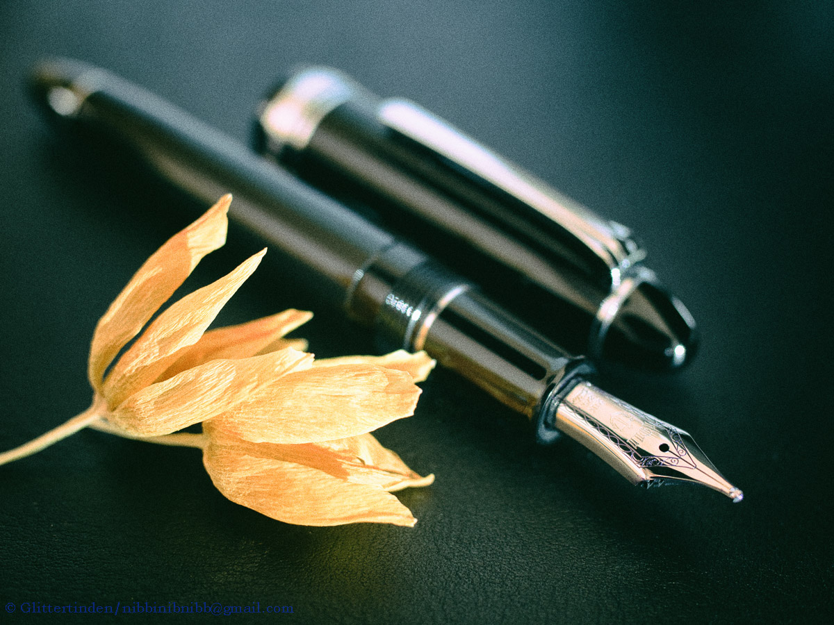
The pen is a classical cigarr shaped pen with a screw cap (is it only my impression, that I have to turn it a bit more often than eg. a Visconti Wall Street or a Pelikan Souverän?). It hast a very regular shaped and unfancy clip, which just works as it should, a neutral finial and a blind cap separated from the barrel with a silver ring (rhodium plated). The cap has a slim and a broad ring, it says in outlined capital letters: “Sailor Japan Founded 1911”.
When you open the cap (two full turns) you get to see the section which tapers down and expands a bit at the very end (to prevent the fingers touchiung the nib and feed).
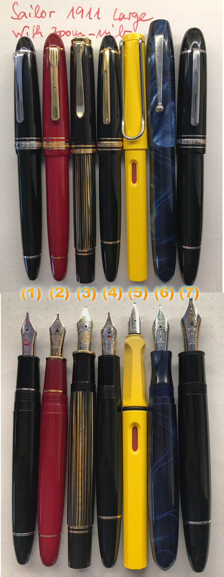
The nib is a 21kt gold nib (rhodinated). The nib is longer than those from a Montblanc Meisterstück 146, but again narrower than that from a Pelikan M800. The fountain pen itself is sizewise very comparable to the abovementioned pens (see image below). The nib of the Sailor 1911L is by no means undersized compared to the rest of the pen anatomy (as it is the case for the Graf von Faber-Castell Anello – just as an example).
The nib shows a flourish imprint, as well as the founding year (1911), the anchor, the carat number (21kt) and the corresponding permille value (875) and finally the Sailor-Logo.
Something I found interesting: the upper part oft he barrel, where the threads are located, looks almost identical to the Platinum President (see size comparison-image), although the caps are not interchangable. Also the trims of the cap look very, very similar.
Material
The Material is a so called PMMA-resin. Well, it does not tell me too much, please feel free to read the respective Wikipedia article:
(https://en.wikipedia.org/wiki/Poly(methyl_methacrylate).
Does it look different from, well, for example the “precious resin” the Montblanc pens are composed of? Yes, it does! But I cannot describe the difference, I am sorry. Is one of both harder? I don’t know, I don’t want to intentionally scratch them with a needle or so, just to prove their hardness. The biggest, “obvious” difference is that the precious resin in MB-pens is slightly translucent (you observe a dark red color under very bright light), whereas the PMMA in the Sailor is absolutely opaque.
Filling mechanism
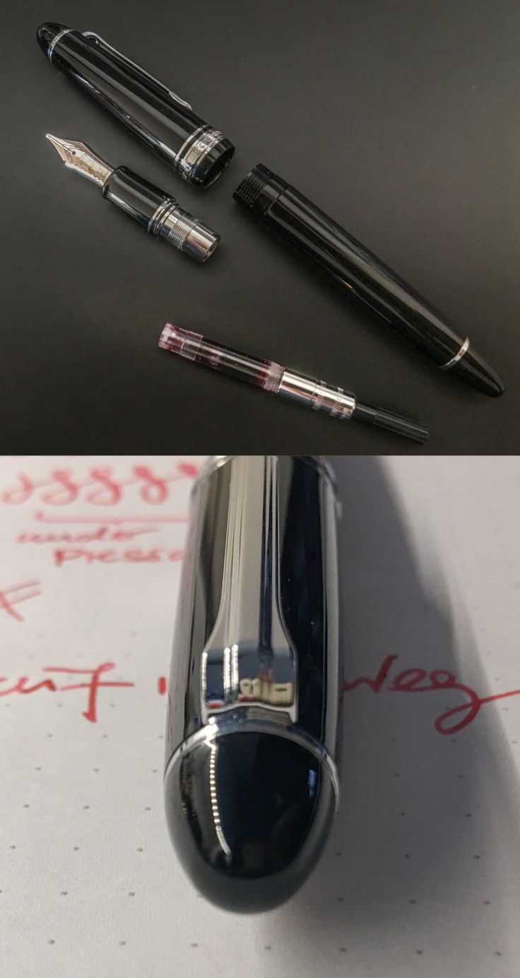
Just a simple cartridge/converter system. But proprietary. “Sandard international” will not work.
Nib performance
The 1911-Series are delivered with EF, F, M, B MS and Z nibs). MS means Music nib and Z means Zoom nib. According to what I have learned about Japanese nib grades the general eqaulization of japaneese F corresponds to western EF (as well as M=F, B=M – so, Japanese grades are one grade thinner than western grades with the same name) applies also here.
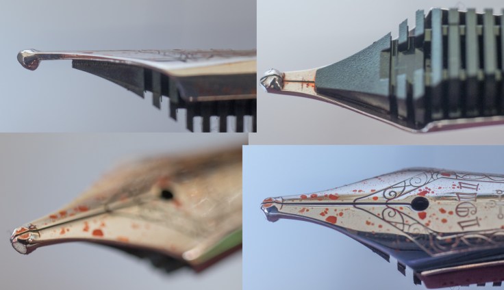
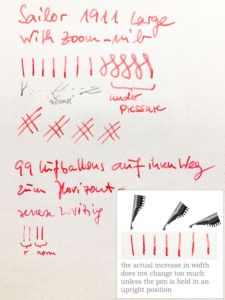
The pen shown here is equipped with a Zoom-nib. This type of nib enables the user to produce wide lines as well as fine lines with the same nib. The stroke-width is dependent upon how you hold the pen (see image below). It is obvious that this type of writing is nothing for a regular use for a quick letter or shopping list. One would use it carefully and with intent on the purpose. Of course, the nib is absolutely usable for a regular use, anyway. When holding the pen “normally” (in the usual 40-50 degrees handholding) the stroke will be a western medium to broad stroke). When flattening the angle even stronger the stroke gets bolder. But actually not very much so. The biggest difference occurs between the upright position (very thin stroke like western F) and the normal type of pen-holding (western medium to broad grade).

Well I didn’t found so far a use for the capabilities of the zoom nib. It might be very good for thin remarks on articles or any kind of book, but in this case an EF-nib or reverse writing of a broader nib does the same job). But this is only me! In the web are numerous youtube-videos available that show the purposes of this nib much better. Back then, when I bought this pen with this nib I was fascinated from it, but actually I had no use from it in practice afterwards.
The nib experience with this particular nib is also not too awsome, since it sounds like a felt pen while wiriting. The tip is very rough and quite often it accumulates fibers from the paper. However, I never experienced a hard start or skipping at all. It just writes.
The nib is quite stiff and shows no flex. The line variation is supposed to be obtained by different pen holding, anyway. Reverse writing is possible (at least with this one). I generally put not much attention to the option of reverse writing in a review, because I made the experience that this is different for each nib (even when it comes from the same manufacturer and if it is the same grade), but if it is possible with one exemplar it is most likely not generally impossible due to the specifity of the nib design.
The same applies to wettness. This is a very individual thing for each nib. This one is quite wet, but another one might be super dry …
The bottom line
The Sailor 1911 is (in a positive way) a very classical (up to unspectacular) pen, which has shapewise much in common with a MB Meisterstück (146) and even more with the Platinum President. Also the handling is very comparable (the balance is a bit different, due the heavy brass from the piston filling mechanism in the MB 146, though). In my opinion, appart from the nib, this pen is absolutely “average” for its class. What I find very special, however ist that the ink never(!) dries out, no matter how long the pen is not in use. No other pen I know offers this (except for the Platinum 3776 … coincidence?). This pen is a reliable well performing, good workhorse.


Your internet site has outstanding web content.
I bookmarked the website
LikeLiked by 1 person