OK, I admit it, I like orange and yellowish inks! They give me the feeling of summer and the sun, which I miss so much here up north where I use to live. Seriously! However, I don’t use those inks very often, anyway … Why? Because I have seen it enough after a while. And because there are also other beautiful ink colors such as blue shades, red shades or brown shades (one can argue, the latter ones are just darker orange tones – that’s right … but then again, not entirely true: a cup of coffee, even if diluted with milk, has nothing in common with orange juice. OK, both are drinks).
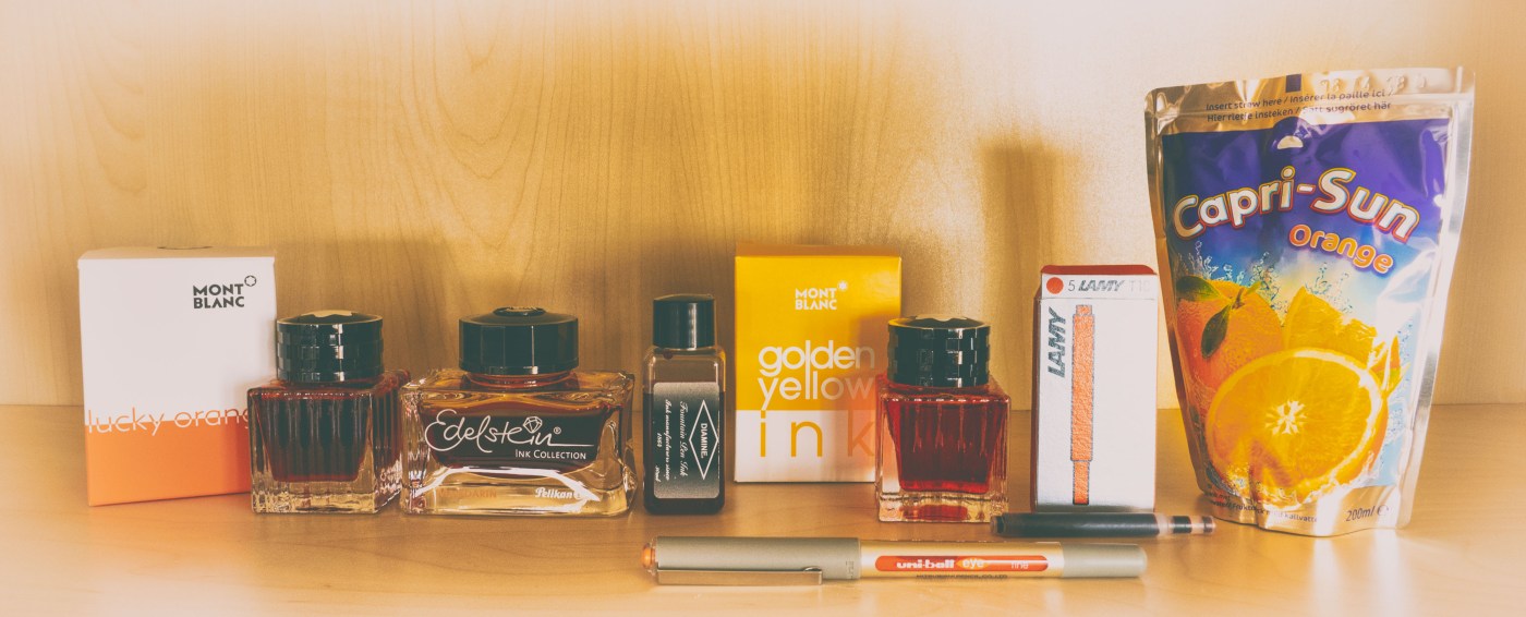
I had a look on the following inks:
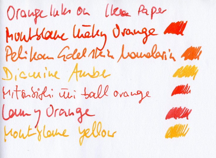
- Montblanc Lucky Orange
- Pelikan Edelstein Mandarin
- Diamine Amber
- Lamy Orange
- Montblanc Golden Yellow
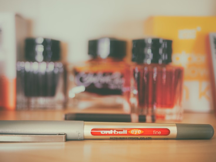
and a roller ball pen from Mitsubishi (uni-ball orange with a fine tip)
Something general
Well, ok, this is my first ink review. And it will be very subjective. I don’t have the possibilities to test the ink with 5 different papers in five different pens (filled each ink, that is), or performing a chromatography, although it would be very exciting, but I don’t have, and will not get chromatography-paper here in Norway, either. Therefore, I will perform a “test” on the papers or notebooks I use to write on most of the time. These are paperblanks journals/note books, Rhodia paper (in white and ivory, i.e. 80g/m2 and 90g/m2) and Oxford or Clairefontaine. Ooops, that’s already five … Ok, but I won’t test 10 papers, basta!
I found it anyway interesting to see how these inks behave on cheap paper such as from IKEA. And since my interest has awaken, I also tried Leuchtturm paper as well as an Oxford office book which was laying around open a couple of weeks and caught moisture (I can tell you it behaves completeley different compared to “fresh” paper). Therefore, an ink-review is always also a paper review, at least partly.
First I tried to scan the writing sample rather than shoot a still of it, because the white balance is tricky to keep constant over several test episodes. But it turned out the scanner resembles the color, and shading of the inks very badly. Thus, I came back to still fotography – even though the white balance is going to hell … But then again, your screens, my honoured readers, will most likely be not calibrated, anyway.
I found some criteria to be important: shading, wetness, show through, bleed through as well as the subtle changes of the line width caused by different absorbency of the papers (I will show you examples).
Since I really investigated the behavior in depth I will devote a separate blogpost to this, afterwards (Part II). However, in order to keep the heads up of the readers so far (you are falling asleep, don’t you?), I come to the point right below.
The Results
In the order of my best liking.
Diamine Amber:
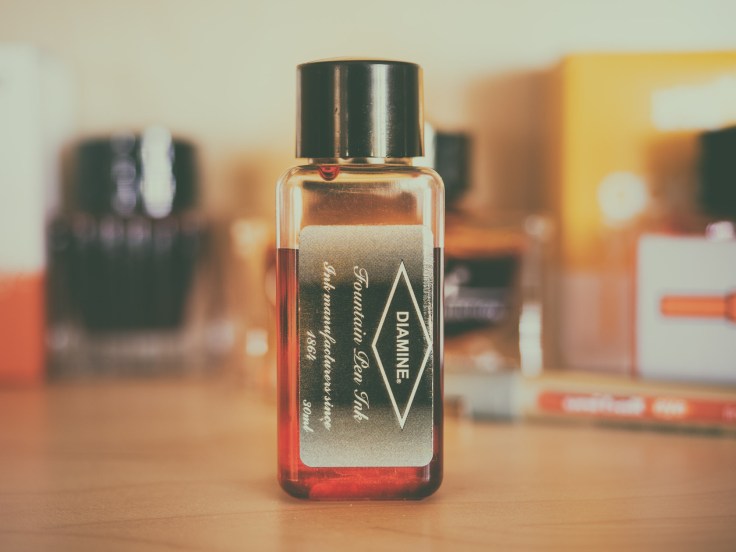
Pro:
- very good shading
- low saturation (I like this feature, people who don’t, may put this into the cons-section)
- quite wet (which I also like)
- no bleed through and show through (strong decline for papers not suitable for fountain pens, though. But that is valid for other inks, too – that’s why these papers are not fountain pen ink friendly).
- cheap
Con:
- nothing, unless one loves dry inks or higher saturated fluids
- ok, there is one more thing: the small 30ml plastic bottle does not allow thicker fountain pens to slip in.
Montblanc Golden Yellow

Pro:
- very good shading
- low saturation
- quite wet
- no bleed through and show through (see the remark above)
Con:
- very expensive
- limited availablity – makes the prices on ebay even higher, when the inks are sold out in most shops – the good thing: Diamine Amber looks similar and is a cheap alternative.
- ink bottle less proper to fill pens than the regular standard bottles (shoe-shape)
Montblanc Lucky Orange
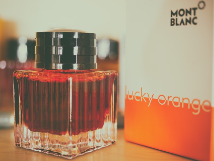
Pro:
- quite good shading but far less pronounced than in the yellow inks
- very “blazing” orange shade
- wet (drying time is long, though)
- behaves good to very good in terms of show through and bleed through on suitbale papers
Con:
- very expensive
- limited availablity – makes the prices on ebay even higher, when the inks are sold out in most shops
- LE-ink bottles are less proper to fill pens than the regular standard bottles
- the luminance fades a bit away right after drying
Pelikan Edelstein Mandarin

Pro:
- shading (diminishes very much on less suitable paper)
- quite wet for an Edelstein ink (my experience is that the Edelstein inks are on the dryer side of the spectrum)
- behaves good to very good in terms of show through and bleed through on suitable papers
- standard ink (no limited availability)
Con:
- not cheap but not extraordinary expensive, either
- no particular cons, it does simply not flash me as much as the other inks do
- ok, one con more: the ink bottle ist bad for refilling pens when the ink level is low. But the bottle itself looks very stylish
Lamy Orange
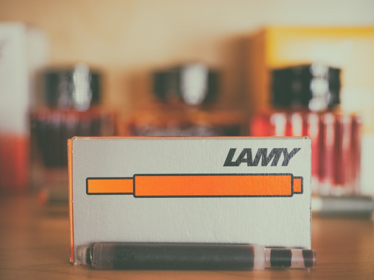
Pro:
- shading on most papers
- technically ok
- nothing very special here, it does its job
- ink bottle contains blotting paper (if this ink is available in bottles – I use cartidges of this ink, only)
Con:
- it really lacks shading and luminance (compared to the other fountain pen inks)
- it s a bit dry to my taste, but some people will regard this as an advantage
Mitsubishi Uni-pen eye orange (fine) – non-competetive
Pro (in terms of for what it is supposed to use):
- dries quickly
- quite luminous ink for what it is
Con:
- surprisingly low eligibility on cheap papers or on those which are not made for fountain pen ink (eg. Paperblanks dayplanner). May be this is due to the fact of the fine tip, a broader tip would not cut out paper fibres so quickly.
The bottom line
The Diamine Amber is very similar to the Montblanc (MB) Golden Yellow in terms of color and shading – on all tested papers. It turns out that the Diamine Amber has the nicest shading (i.e. the most pronounced) of all tested inks. Also technically, in terms of show through or bleed trough it shows the best behavior, followed by the yellow ink from Montblanc. This is most likely the effect of the brightness (it is obvious, the brighter the ink the less it will shine through the paper). All inks loose their “capabilities” on “bad” paper such as the paper from IKEA but also expensive ones used in the paperblanks dayplanner. This paper is thinner and a bit more smooth compared to the remaining journals from this manufacturer – thus, even though the paper used in the dayplanner might be qualitatively very good it is simply unsuitable for the use of fountain pens, though. I did not check it out, but it might be much more useful for ball pens.
Whereas the Diamine ink plays out its best properties on the suitabe paper types, behaves the MB Golden Yellow best of all inks on the less suitbale papers. Anyway, serious fountain pen users won’t pay too much attention to unsuitable papers, don’t they?
The Edelstein Mandarine ink behaves more averaged, comparable to the MB Lucky Orange which is a bit more saturated and more “flashy” due to its intense brightness. On less suitable paper both inks loose their nice properties (shading and brightness).
Lamy Orange is somewhat the weakest ink in the list without beeing bad at all. Just to my taste it has no fresh looks and technically it is more prone to show through or even slightly bleed through some papers. The shading of the Lamy is quite well and not worse than Lucky Orange or Edelstein Mandarine, but is outcompeted by the more yellowish inks on the list (Diamne Amber and MB Golden Yellow).
One aspect I found out is, that “aged” paper, that lie about on a desk for a couple of weeks and might had caught moisture (not rain!), looses dramatically in quality so that the aging kills somewhat the performance of the ink (or the paper …).
For the sake of fun I also checked out a Japanese ball pen, the Mitsubishi uni-ball Orange. Well its ink is quite boring (e.g. no shading at all) but without claiming to be fancy, of course. Well it does its job quite ok, but is surprisingly prone to show through and bleed through on both types of papers, the suitable ones and the less suitable ones for fountain pens.
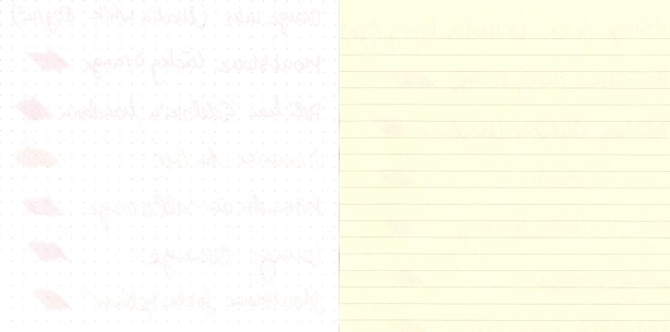
The writing samples
Here, still shots and scans are shown. Note that scans do not resemble the luminousity and the shading of the inks properly. Photographs suffer from unsteady white balance, though. I only give here some examples of the numerous papers I checked out).


A great review and a useful resource for future reference.
LikeLiked by 2 people
Thank you for the kind comment!
LikeLiked by 1 person
Your web site has excellent material. I bookmarked the
website
LikeLiked by 1 person
Hi there! Such a great write-up, thanks!
LikeLiked by 1 person