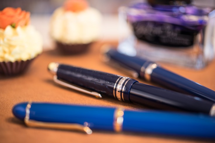
Today I want to share something blue with you. Blue coloured fountain pens, that is.
Two of them are somewhat brand new. I talk about the recently released
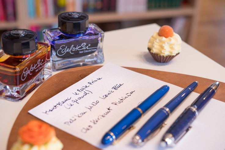
- Pelikan M120 Iconic Blue
- Montblanc Meisterstück Legrand Le Petit Prince and the
- Cleo Skribent Paltinum Blue
Do these pens have something in common – except for the blue colour? Well, they are fountain pens. And they are on the expensive side. They are also not unique since they are pens based on well established lines with a bunch of different colours (e.g. the Meisterstück Legrand, better known as 146). That means, they are basically »just« blue versions of established lines available in black (and other colour shemes), otherwise. Anyway, I do not remember Montblanc ever produced a plain blue coloured Meisterstück fountain pen, and a Pelikan in plain blue is also not so common. Therefore, I was thinking it would be nice to supplement these two new ones with another blue one from my collection which is not very known in the community and I find quite underrated. This blog came out of a whim. Blue is my favorite colour (at the moment) and I found it a good idea to put these three pens together.
What are they looking like and what are the features?
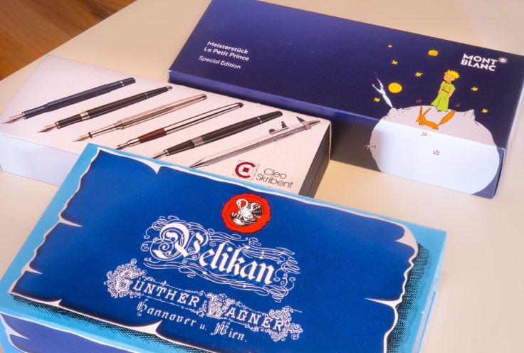
The Pelikan M120 Iconic Blue is a quite short and light weighted fountain pen. The shape is very classical (cigar shape). It has a piston filling system. The Pelikan webpage describes it as a reissue of the »historical M120 line«. The reissue of the line started in 2016 with a black/green coloured fountain pen and the Iconic Blue is the second incarnation of the this series. Both are only available as a fountain pen (no pencil or ball pen). The pen comes in a blue retro style cardboard box together with an ink jar (filled with 4001 royal blue blue ink – what else?). Quite nice. But honestly, packages are not very interesting for me. I am not a collector, rather than a user with not enough space to keep all of them for ever. OK, this is not my fountain pen, either – I lent it out. Anyway, the box is in retro-style but a bit fakey, because all what should be a tag or sticker, resembling the old fashioned way, is actually only printed on the box, inclusive the dog-ears from the pretended excessive using and touching. Could be worse, yes.
The pen is advertised as a«Special Edition«.
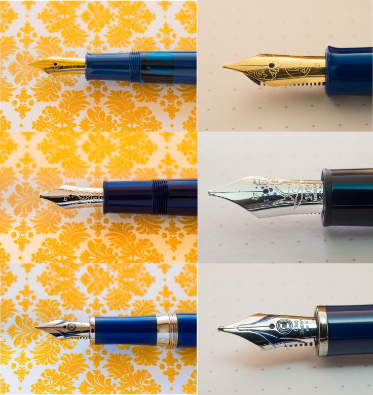
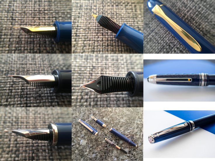
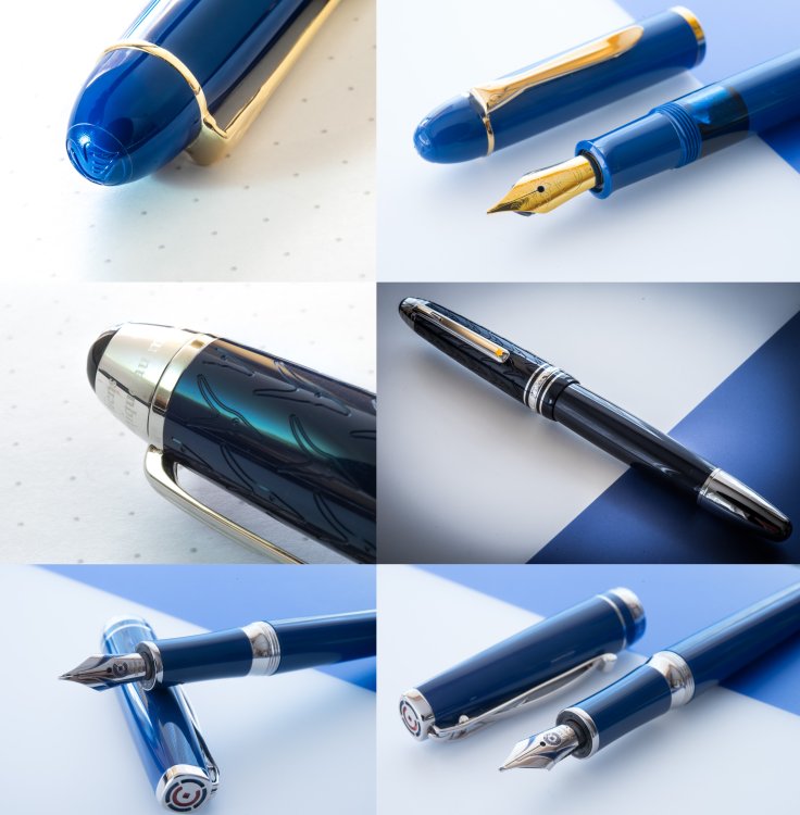
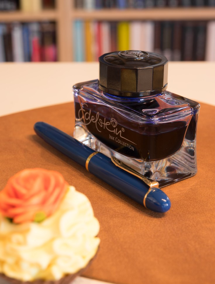
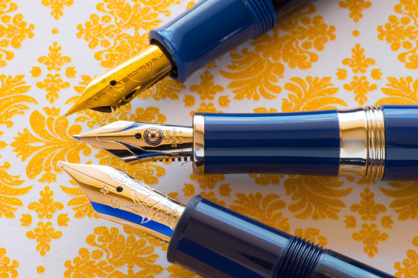
The resin is shiny and has a very nice touch – it feels good, that is. It is a rich blue which blends very well with the few complementarily warm gold trims, clip and and the old-fashioned looking nib. The pen is very low on »bling bling«, actually, only the cap has a single gold plated ring (with an imprint saying “Pelikan Germany“). It lacks rings at the end of the section or the barrel as the pens from the Souverän line). I don’t miss those trims, it fits well without it. It does not look cheap or something. The gold plated nib has a very nice orange (or may be deep yellow) shade and looks very nice. It has a pretty floral imprint (together with the Pelikan logo). This logo is embossed also on the finial. Very felicitous is the ink window in a turquoise shade (when light shows through, otherwise and if filled with ink it looks dark). It is broad enough as well as translucent enough – just pretty and usefull. The clip is the well known pelikan beak. All in all, the pen is unpretentious and shows a balanced amount of trims and plastic parts. The colour combination make it looking special.

If I compare the plating of the trims as well as the resin with more expensive Pelikan pens, I don’ see a difference at all. The pen is not overly expensive. It costs 170€ together with the ink. But one has to pay for the fact of being a »special edition«. For an extra-fine nib one has to pay 17€ more … Oblique, double broad or italic nibs are not even available – a shame, if you ask me.
The Montblanc Le Petit Prince is sold in the standard »coffin« but is wrapped in a dedicated cardboard sleeve with the »Petit Prince« theme (some stars in a blue nightsky, the little boy and the fox). The ensemble is completed with a small booklet telling something about the history about the novel »Le Petit Prince« and its author. The »Petit Prince« theme is also to find in a solitair version as well as a classic version. Here, I am takling about the Legrand-version. In terms of shape and size it is a regular Meisterstück 146 in a very dark blue garment with silver coloured trims (I guess, rhodium plated). The only immediately visible difference to a regular Meisterstück is the metal piston-twisting-turning knob.
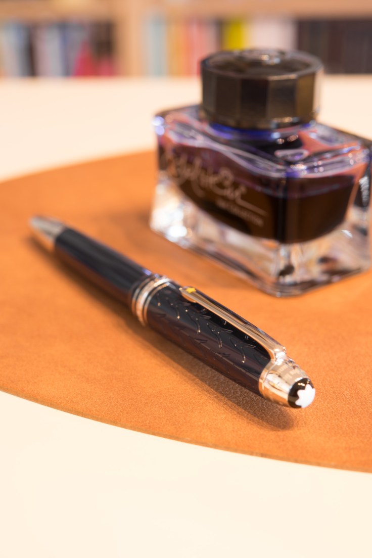
Well, this pen is just gorgeous! The dark blue resin fits very well with the somewhat cold silvery trims. The endcap has also sort of a metal-collar just above the clip-ring. It has an imprint on it (a citation from the novel in french language). The cap is engraved with the outline of the head of this surprisingly long-eared fox. Quite nice since the edges of the embossing reflects the light very specially (cannot describe it properly, sorry). The fox-head, the little boy and a couple of stars are also to find engraved on the (rhodium plated?) gold nib. Very cute I find the little yellow/orange star on the lower part of the clip – a nice detail.
There is one thing I was a bit dissapointed of: the actual very dark blue colour of the pen is not at all resembled by the much lighter looking blue in the images which can be found in the internet – inlcuding the Montblanc-webpage. Very misleading. I ordered it in a dutch webshop and was a bit surprised when I unboxed the pen. Actually, I like the dark blue tone very much, but the fact of the mismatch between reality and internet-images I find irritating.
I ordered the pen with an oblique broad nib (is Montblanc the only vendor which still offers oblique nibs without an extra fee?). Well, the choice of a non-standard nib (F, M, B), requires a nib exchange in Hamburg and therefore a delay of shipment by circa 10 days. The pen was shipped from The Netherlands to Hamburg back to The Netherlands and then to me to Norway. I have to say, I am an absolute lover of oblique nibs. And I am happy Montblanc delivers such nibs still without extra costs. Pelikan does no longer produce such nibs and for example a stub nib from Visconti costs an extra fee. I may be wrong, but also Lamy does no longer produce oblique nibs (but they do produce italics as well as calligraphy-nibs for their standard steel nibs in the Safari/Al-Star range). Anyway, this is another discussion.
This pen is also a »Special Edition« which means it will be produced a limited time periode – at least to my knowledge. And which also means the price is … well …extraoverlyinordinarily elevated … That’s how it is … Anyway, the extra-features, such as the rhodium plated piston-twisting-turning knob, as well as the irregular nib or the engravement of the cap and the little orange star on the clip are worth the extra charge (compared to the regular Meisterstück) – at least for me.
Now to the Cleo Skribent Platinum. This is a pen which is in production already a couple of years. I own a similar pen already in a burgundy colour. It was called back then as »Cleo Skribent Tertius Gold«. Both look the same except for colour (resin and trims).
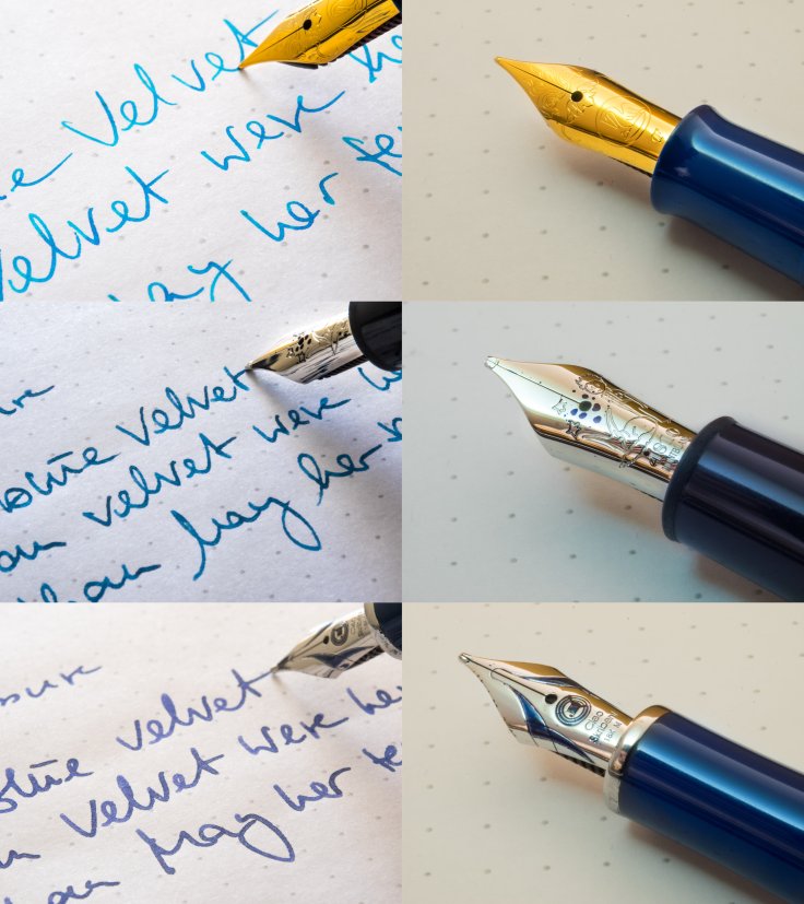
Since this is a regular production model it is packed in a likewise quite regular box with a cardboard sleeve. Nothing very special. The pen has a markedly elegance in shape and trims. The blue shade fits well to the platinum trims. In contrast to the Pelikan this colour scheme gives it a cold note (in contrast to the warm note of the yellowgold trims of the Pelikan). The downtapering of the barrel, together with the silvery ring and little endcap provides a slightly feminine impression. Slightly, not too much for me. Barrel and section are separated by a nice concave metalring. Therafter follows the threads for the screwable cap. The section is also slightly concave and ends in a silvery plated metal ring. The nib is on the smaller side of the range (comparable to a M600 or Meisterstück 144). It has an imprint reminding me on architecture or furniture from the twenties of the last century. Partly painted in a blue tone. Here, I must say, the colouring is not extraordinarily accurately crafted (the burgundy version I own is much better conducted). Anyway, this is something visible only with a magnification glass. Like many modern vendors, nibs are only available in the standard sizes F, M and B. The B-nib might be stubbish – at least the Ebonite-series from this manufacturer shows a stubbish character). Also the clip is very nice and resembles the abovementioned architecture. Absolutely gorgeous if one likes it playful. The only draw back is it gives a bit a fragile impression.
The resin is one of the best resins I have seen in the fountain pen world. It is absolutely comparable with the resin Montblanc uses (believe it or not, here is a difference between the plastic-types of MB, Pelikan or Sailor).
Related to the design this pen is quite a difference to many other pens in the fountain pen world.
It is a cartidge/converter pen!
How do they hold in hands and how do they write?
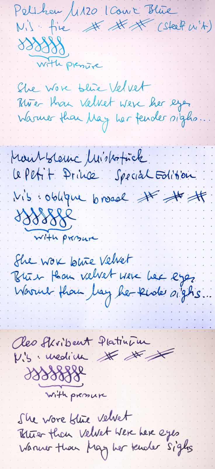
The Pelikan M120 has about the same weight and size as a Pelikan Souverän M200/400. It’s low weight makes it for me rather unusable. It is not so much the lacking girth or length, but simply the low weight. Anyway, the fine nib writes extremely smooth. Yes, it has a little feedback, but this is expectable and by no means irritating. The nib has almost no flex, but is no »nail«, either. With pressure a little visible variation is possible. For a fine nib, which I absolutely not prefer, it writes very well. People who love fine nibs, will love this one, too. But of course, the fine nib of this individual pen does not necessarily represent all available fine nibs – and my subjective opinion may not correspond to other users.
The oblique broad nib from the Le Petit Prince is a dream. It has a width which fits quite well to my taste. It is smooth as well. Nonetheless, it is a typical modern Montblanc nib, with no significant flex to it. Not a nail, either. But offers no surprise to those who are familar with modern Montblanc nibs – in the Meisterstück pens, that is. The modern Heritage-line for example is quite the opposite of it: very soft, the tines are bending up quite much, but again no spreading of the tines to the sides (no flex that is), either.
When it comes to handling of the pen: it is a bit different to the regular Meisterstück pens, due to the metal piston-twisting-turning knob. This feature makes the pen less balanced and top heavy. And heavier in general. Actually, the position of the barrel and the turning knob gives a bit more »swing« to my handwriting. The pen feels better in my index finger and thumb and rests better in my hand, if you understand.
People who own or have access to the MB 146 Ultra Black, will not find any difference in writing/handling behavior.
The Cleo Skribent Platinum is just a little bit less heavy than the Montblanc. But due to the more equally distribution of heavy parts, the weight is more balanced. Not necessarily better for my writing. Actually it works quite well despite the lacking top heaviness which fits quite well in the MB. The biggest difference is the smaller diameter of the section compared to the MB. For people loving a bit more girth, long term writing can be a bit crampy with this pen. For those who loves it thinner, it might be probably better. The nib on this pen is a regular medium with no stubbish character. The nib tip is quite round. It writes wet and smooth, in terms of springyness it is comparable with the other modern nibs (those which are not announced to be springy/flexy, that is). However, this particular nib (and also that one from the burgundy-coloured sibling) is quite strange because it »sings«, Yes! Well, in a particular angle of settomg the nib to the paper, namely with a bit »weight« on the left tine it vibrates under a recognizable humming. The nib spreads then very tiny droplets of ink on the paper. I find that funny.
Would I recommend them and would I buy them again? Or as a present?
The Pelikan M120 Iconic Blue I would not buy for my own purposes. This is just due to its small size and weight. However, I would give it away as a present (or recommend it) to people who like exactly this. I like the looks very much because I like blue colours. The steel nib is also very good to write with – as I mentioned, I am not a friend of fine nibs at all. I only find this pen a bit overpriced for a fountain pen with »just« a steel nib. But given the fact, that it is a special edition, why not? If one is just after a well writing Pelikan pen which is cheap(er), a M200 works equally fine, I would say – the M200 is just one gram lighter than the M120.
The Montblanc Le Petit prince I would buy again, due to its weight and weight distribution. I talk about the relation to other pens of the Meisterstück 146 range. Also the blue resin together with the colour of the trims makes it a bit unique. But honestly, it is darker than expected. And yes, for me it is worth the extra money (no need to discuss the absolute price of a MB-pen here). If one is after a more cheap (hehehe) Meisterstück, one could go for the regular resin-only Meisterstück. But they are not exactly comparable due to the lower weight (and the colour). The Writers Edition for example which is also based on the Meisterstück 146 (nib size, feed, piston-filling system) might be comparable in terms of price but consist of different materials and are anyway shaped quite differently and will therefore have a different handling. Comparable to this pen is only the Ultra Black (weight and shape). For people who love the »Le Petit Prince«-theme and the respective novel this pen can be a nice present.
The Cleo is actually even fancier than the Montblanc. It is also by no means cheap (ca. 370€). I have actually two fountain pens sharing the same shape, only the colour is different – but are from a different series (at least when they came out). So, I would buy it again. As a present to a fountain pen lover who is after a relatively »unknown« brand (and, as I find underrated) it would be a good choice. It is a bit on the feminine side I would say.
Writing Samples
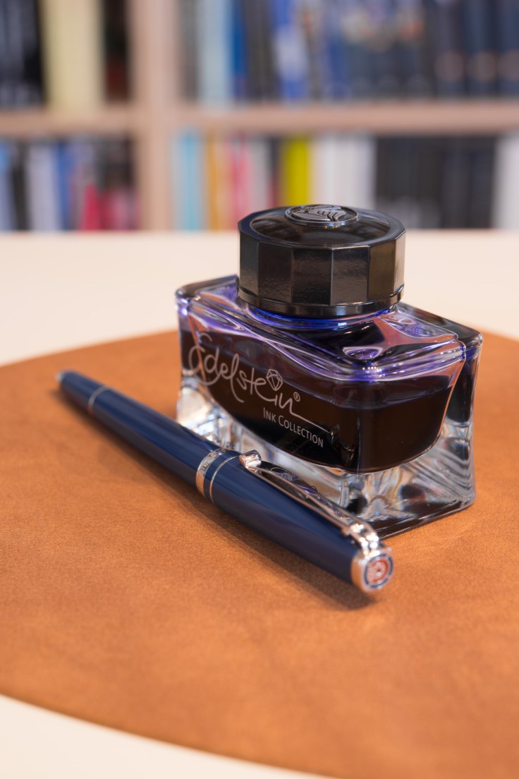
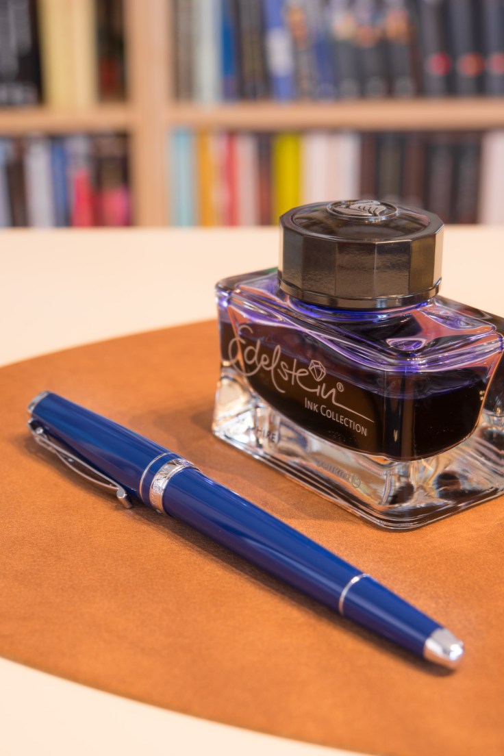
Impressions
Just a few pictures …


Thank you for these detailed reviews. Three pen reviews in one post, is a lot of work. The writing sample of the Mont Blanc oblique nib looks particularly nice and I am glad that you are happy with it and would buy it again.
LikeLike
It was a lot of fun for me to write this review, in particular to gather it under the banner of blue colouring scheme. Actually my spouse owns a M600 in blue, but four pens I found too much and a bit arbitrarily, too.
With respect to the OB-nib I have to say, Montblanc has the best oblique nibs I know about. At least when it comes to modern pens. I was never disappointed with obliques from MB. Comes in addition, that many other brands do no longer produce such nibs (or with extra costs). May be the customers are no longer after such nibs because regular M-nibs usually write without any problems and when a customer just orders from a webshop this saves for getting disappointed … In a physical shop the fountain pen buyer could check self which nib grade and cut is appropriate.
LikeLiked by 1 person