
This is going to be a split ink-review. The conventional part of the description of the inks with the appraisal of its properties together with writing samples and its pros and cons you find in Part I (after the introduction). A further part deals with the examination of the subtle differences both inks show.
I am a big fan of burgundy red inks (you can call it also «bordeaux»). Due to its shade, and juiciness (dependent upon the pen, of course) and not so strong saturation I like the issue from Montblanc very much. It shows a good balance between red and blue colours. It is not too saturated rather than quite bright, as I like it!
Some views to the side to the big pool of other ink manufacturers let me stop at Monteverde inks – they are also Monties: must be a good omen :-). I used the Monteverde ink in a couple of pens and “wow”, I thought, it looks quite good, not to say quite similar to the version from the french sounding but still german Monties. Or swiss (MB belongs to Richemont)? Or even austrian (their inks are produced in Austria)? Well, not important here … And now I find out where the differences are.
Part I
Montblanc Burgundy Red

This ink has a good flow and for a dark red ink a not too strong saturation. When I say “too strong” than it means, that I am actually not to fond of highly saturated inks (for example the Diamine Bilberry is highly saturated). The translucent character gives much room for a pleasant shading. The ink shows no issues in respect to show-through (below average in strength) and bleed through (none at all) on Rhodia paper (on other paper like some Leuchtturm-notebooks it does! But I don’t use that no longer. Here I must say, I heard that some Leuchtturm products are fountain pen friendly, though).
Since it is one of my favorite ink colours I use it in several pens and I have observed that for example in the Montblanc Johannes Brahms it behaves much different, I mean much brighter, than in a regular Meisterstück. Also in the here used Pelikan M200 (with a gold-nib and not the regular steel nib) it writes a bit darker. Yes, it is possible, that different pens show different wetness, of course they do, but it is not the case, that the Brahms offers a lower wetness. It comes in addition, that the Brahms has the same feed as the regular (modern) Meisterstück.
The ink comes in the quite useful shoe-shaped ink bottle.
pros:
- good flow (not overly but a bit on the wet side)
- nice shading
- quite lubricant
- no bleed through (on my favored Rhodia paper)
- show through present but does not matter to me (tested on Rhodia paper)
cons:
- actually, nothing as long Montblanc does not decide to let the ink prices of their sort of standard inks go to the roof. But you can help yourself by just buying the Monteverde ink, because it shows almost no difference.
Monteverde Burgundy

No joke, read what it is written under the Montblanc ink. Both inks behave the same, technically (in terms of bleed trough etc.). OK, the Monteverde ink might be slightly darker (or stronger saturated). The ink bottle is quite standard and not overly pretty.
pros:
- good flow (not overly but a bit on the wet side)
- nice shading
- quite lubricant
- no bleed through (on my favored Rhodia paper)
- show through present but does not matter to me (tested on Rhodia paper)
- not cheap but not expensive either (90ml for 12€, but in the UK for 11-15£)
cons:
- actually nothing, except that the jar is not predestinated to make it easy to fill a pen, when the jar is close to be empty.
General inspections
Red inks are sometimes accused for leading to nib creep or leading to precipitations on the nib and in the feed (clogging it eventually). I use burgundy ink from MB since years (and Monteverde since ca. 2 years) and I never ever encountered those nasty things at all with none of the pens I filled this inktype with.
Writing samples and comparisons


Would I buy or skip buying one of the inks?
Call me overcarefully, but within warranty-time of Montblanc pens, I prefer to fill these with MB inks. After this I go over to inks from other vendors. So, actually, there is no need to stick on MB-burgundy ink unless I continue leaving my money in Montblanc Boutiques …
Part II – get in depth with paper chromatography
The similarity of both inks emerged the wish to check this out in deeper detail.
I have seen once that a fountain pen enthusiast was using a quite simple analysis-method of paper chromatography to investigate the different colour-nuances within a fountain pen ink. This was awakening memories of the days in school, when we performed this simple method on green plants (chlorophyll) and also on colour pens.
Therefore, I decided to go for the same method just to see which separable colour components are included in the inks. Not only in burgundy inks, I also checked out other inks (eg. black inks – which can be quite colourful, in fact :-)).
I also tried to go further than “just” a visual inspection of the chromatogram. In case of that similar inks, I expected not to big differences, but the differences which are in place needed to be quantified – well, semi-quantified, that is.
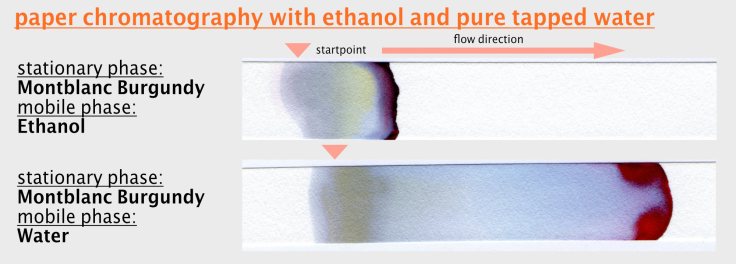
I also experimented with the so called “mobile phase”. Putting the ink-charged paper-stripe into pure tapping water (the inks are water soluble) lead to a complete different, not say disappointing, chromatogram than after use of salt-water. OK, how does a paper-chromatography work at all? For details switch to Wikipedia, please.
I have to state here one thing clearly: I am not a chemist at all – may be you will find out much quicker than I would hope …
I am somewhat familiar with image processing and related software, but not an expert in this particular matter when it comes to paper chromatography. Please take this in mind. Thank you. If you have suggestions to improve the setup and analysis I appreciate it if you leave a coment!
Skip the next part if you are familiar with the concept and setup.
Setup
You have a little container filled with your mobile phase (here salt water), which should wander through the chromatography paper (short cp) by capillary forces. The ink was put on the paper by an eyedropper (you can also draw a horizontal stroke with a fountain pen). Put ink on the lower third or quarter of the stripe. If you have a setup allowing several experiments at the same time, lable the cp at the top region with a ball pen or pencil. Put the bottom of the stripe into a basin filled with the mobile phase so that (a) the ink has no contact with the phase and (b) with the wall of the basin, either. Wait until the waterfront (or whatever phase you chose) went through the ink line or drop. After a while, when no more separations are visible and the waterfront reaches the top of the paper, without being coloured (no components are transported any longer) you are done. Let it dry and store it dry.
After the experiment – Processing
The chromatograms were scanned and saved as .jpg-file. The files were imported into Lightroom (a common image developing software, I guess most of you know about it).

What am I after? I am after the different colour shades the chromatogram offers. Of course, the visible (and scannable) colours can be inspected by eyes. And what you see are in case of the burgundy inks some red, blue and pink shades, mainly, that is. There is also a little bit grey-greenish involved. So, we have red, and blue and a bit of green. Here a RGB-separation would make sense and would be enough. But as we will see later, it won’t be. It comes in addition, that burgundy inks are not the only ones I intend to prepare a chromatogram from. What’s about more yellow-ish inks? Or brown ones? I expect some yellow tones covered by the chromatogram from other inks, too. And then a pure RGB-separation is a bit too less.
Since I want to prepare something meaningful with the tools I have, I decided to use the black-white-developing tool by Lightroom (fig. 6). It offers filters of several colours such as red, orange, yellow, green, blue, aquamarine (a turquoise shade), lila and magenta (pink).
Therefore, I would obtain by proper use of this tool, seven different colour signals, each provided in seven different grey scale images. “We are talking about grey shades?” you may ask. Yes! But hey, only seven – leave the ropes in the closet …
It is the only option for me to deal with more than the three RGB-colours. Comes in addition that, I have to process the images further in another more advanced software, which is called fiji. It is also the case, that not every colour is covered by the black-white filter from Lightroom.
What you get after the black-white-conversion and using one of the color filters (say red) is an image which shows a grey scale image of the saturation of the filtered color (see fig. 7). If the image (here the chromatogram) shows much red, you will get dark shades, where all the red is. By application of the green-filter you will get a grey dark shades, where the green color is located, and so forth … Unfortunately, what you also get in all the filtered images is something which is not covered by the filters or giving an extra-information (I am not clear about it) – this what I would call “background” or may be “noise”. Honestly, I am not deep enough into this matter, so I am most likely lacking the correct terms – may also lacking the correct approach at all… I am just doing this intuitively and this might be wrong. Please tell me, what I can improve. Thanks!
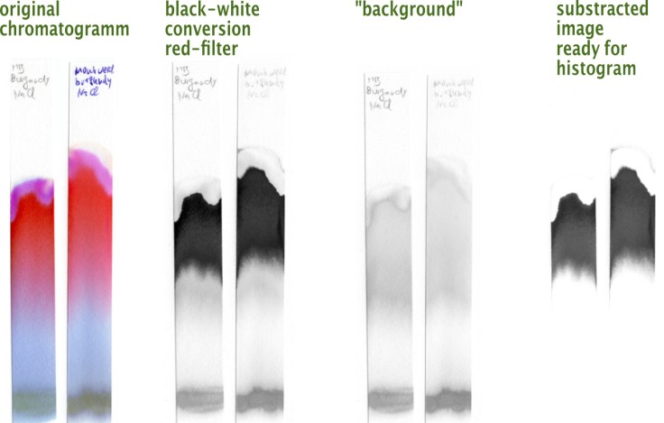
Anyway, after some unsatisfactory experiments with Lightroom, fiji (and Excel), I found out, the abovementioned “background”-image has to be substracted from each of the 7 color-filtered images. The “correct” color-filtered image (for all of the seven filters Lightroom provides) is this one, which covers the information of the color minus the background. For this I used fiji. Also in fiji, I selected the area with the grey shades (again, which represent the color filtered out by the abovementioned processes) from all the chromatograms (see fig. 6). The histogram was converted to an Excel-file and loaded into it and a chart was created.
Weaknesses of this approach
For a 100% correct quantitative analysis it would be important to put a defined (and constant) amount of ink on the cp. Also, the chemistry of the mobile phase (here salt concentration) has to be constant (and known in case of a repetition with other inks in the future). Ambient temperature and air moisture need also to be under control. Well, all these things I have almost no eye on. I find it not too important to say wether an ink contains 2% of a greenish component, 4% might be also fine :-). I am not driving a chemical laboratory.
To cover the constituents of ink it would anyway be important to check several different ink jars – for me an impossible task.
What I try to keep constantly for future chromatographies might be to suck ink into an eye dropper and pour it on the cp or taking the “fresh” ink from the nib (and the feed-fins below). Ink coming out of the ink barrel of a pen might be a bit altered or not showing all of its components – otherwise we would not observe e.g. a brighter ink shade from pen A and a darker from pen B … Can be interesting to examine this further. May be later.
In terms of image analysis of the scanned chromatograms and the postprocessing in a dedicated software, there might be much smarter ways to cover the bunch of involved colours. Lightroom offers 7 different colour shades (where aquamarine, magenta and lila already show overlap with each other together with blue and red) which may be good for reddish inks. But even here it has turned out that there is still “something” not covered – a lack in capability for a correct quantification (and description).
Evaluation
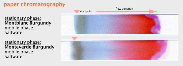
The visual comparison between both chromatograms reveal two main colors: light blue and red shades (from diluted, brighter red to stronger saturated red). Additionally, a pink component is added. The initial starting point remains in a grey-greenish rest after the salt-waterfront was going through it. Overall, there is no much difference between both chromatograms. Four slight differences are however observable:
- pink (or magenta) is a bit more saturated in the Montblanc ink
- red is also slightly more saturated in Montblanc burgundy
- at the starting area of the Monteverde ink is a bit more saturated and is a bit more greenish.
- The chromatogram of the Montblanc ink ends with a very little blue stripe, whereas the Montverde ink ends with a very diluted yellow/orange-ish stripe.
These differences are not consistently reflected in the ink behavior when used in a pen on paper. Actually, since the Monteverde ink seems a bit more saturated, one would expect the reds and blue become stronger than in the Montblanc ink. I actually don’t dare to call the difference in saturation of red and blue to be significant since it is possible that the amount of ink placed on the paper was not exactly the same (less ink leads to stronger dilution).
Do the histograms reflect what’s to be seen on the chromatogram?
Judge yourself. I would say, it does. The green component adumbrated in the Monteverde ink is actually reflected in the histogram. Very low saturated though (on the left side of the histogram), but still. Also, the light blue component in the Montblanc ink is seen in the histogram. At least I interprete the aquamarine-signal like this.
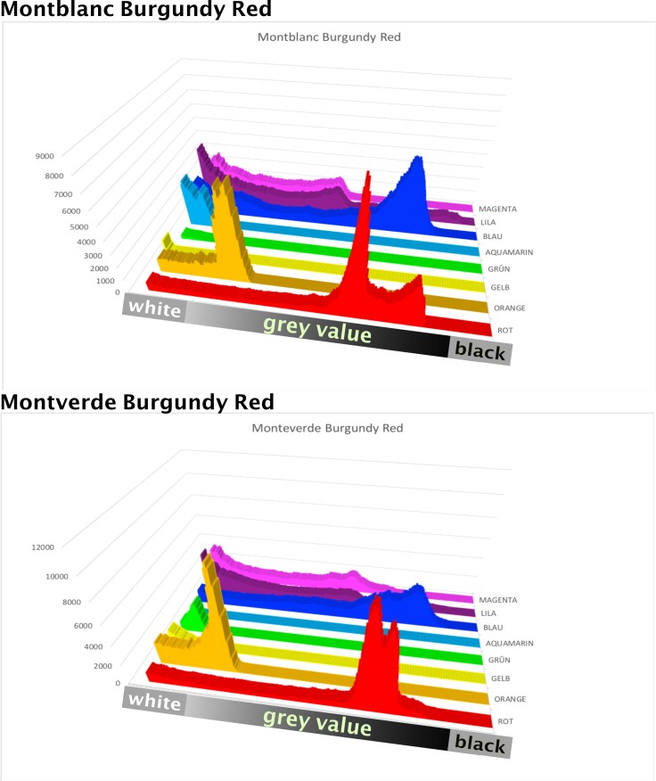
I spare here to quantify the amount of each separated colour since (a) the “background” of unknown colours is not to quantify and the initial amount of ink used for the chromatography might not exactly be the same. But it is semi-quantitative since one can estimate the proportions of each identified color. Here it is very obvious that reds and blues are the majority.
All in all, quite satisfactory as I find. I will try some other inks in the same way and will present here …
See you next time!


Thank you for such a detailed review of these two burgundy inks and dor describing your method. I have both of these inks. I was disappointed when I discovered that the colours were so similar and perhaps even identical.
LikeLiked by 1 person
Yes, from the perspective of having two bottles of almost identical inks, this is disappointing. From the perspective to have a cheaper alternative to the slightly expensive MB ink it is nice :-). Anyway, I like burgundy inks in the way the MB/MV are. The Diamine inks Syrah and Crimson are also dark red but show differences. The Rohrer & Klingner Alt Bordeaux has a much bluer Touch and is very wet and more saturated. I mention this, since the R&K has Bordeaux (burgundy) in its name. Can be worth to check out!
LikeLiked by 2 people