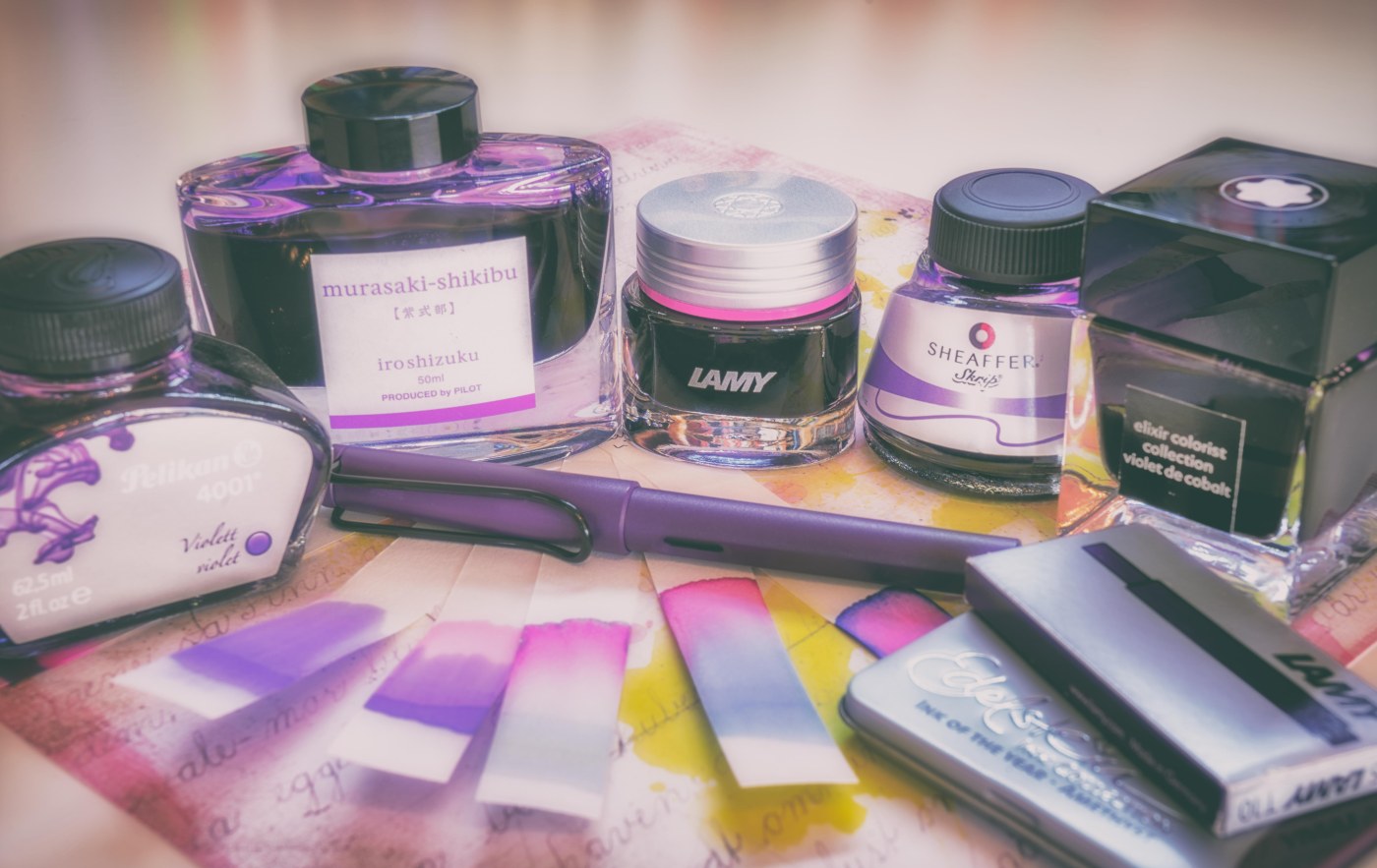
Today, I want to share with you some impressions on purple inks from my collection. Purple is meant in a broader sense, reddish inks with some blue additions – or the other way round.
Three inks of the nowadays occurring trend of inks named after gems, are included in this review. To my feeling it came into vogue to market fountain pen inks with names like »topaz«, »ruby«, or »amethyst«, etc. The »Edelstein«-series (German translation of ›gemstone‹) from Pelikan is on the market a quite long time, though. Also, here and there some ink producers gave their inks already names after gemstones (like »turquoise« by Diamine or Pelikan) – a labelling which fits quite well to the actual colour leaving no confusion.
Anyway, Lamy put a quite new series (so called »Crystal Ink«) on the market as well as Montblanc with their »Elixir Colorist Collection« series. In particular the price range of the latter one is on top (and fourfold so much) of everything I knew before … However, I bought one bottle of the »violet de cobalt« only for you my fellow readers. Unsurprisingly, these high-grade-inks show no better writing results than the common inks from the same vendor. But this is only my subjective opinion, of course. I anyway cannot conceal a certain deslike of the gap between marketing/pricing and the actual properties of the high-grade inks. After all, these are not limited editions which may justify a certain price difference.
A last complain refers again to the naming: a beryl for example is not necessary a pinkish gemstone (such as the colour of »Lamy Beryl« suggests) but actually more often green in color – this can be quite misleading.
Enough complains. The provided colours are enjoyable and that is what counts. The properties of the inks are also quite good (even though not better than more regular low grade inks).
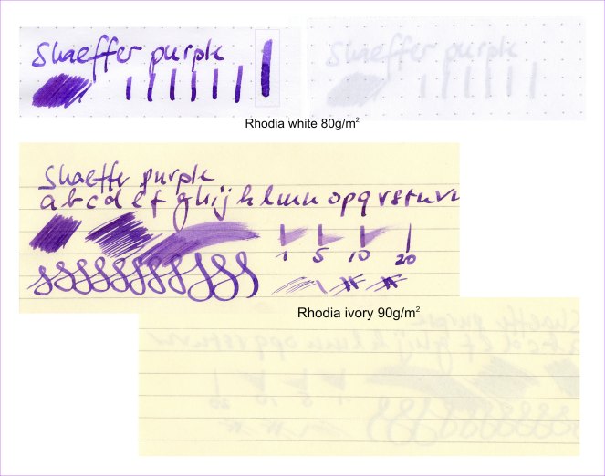
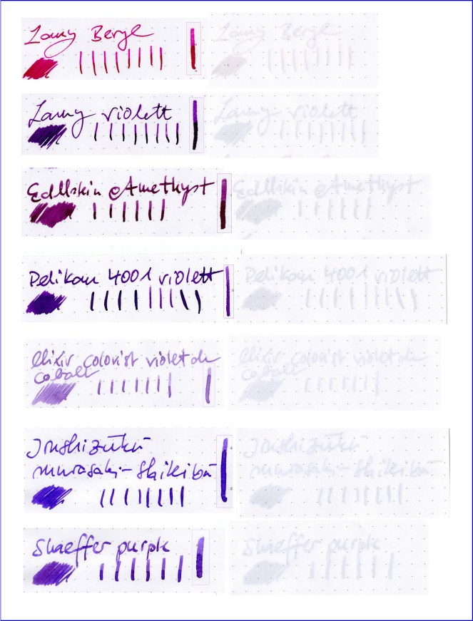
Like always when I introduce inks I avoid using way too subjective impressions (e.g. wetness), since some features are very dependent on the used pen and the paper. I use Rhodia paper (in white with 80g/m2 and ivory with 90g/m2). All parameters like wetness or shading and drying time are evaluated relative to the others in this test and are by no means quantitative.
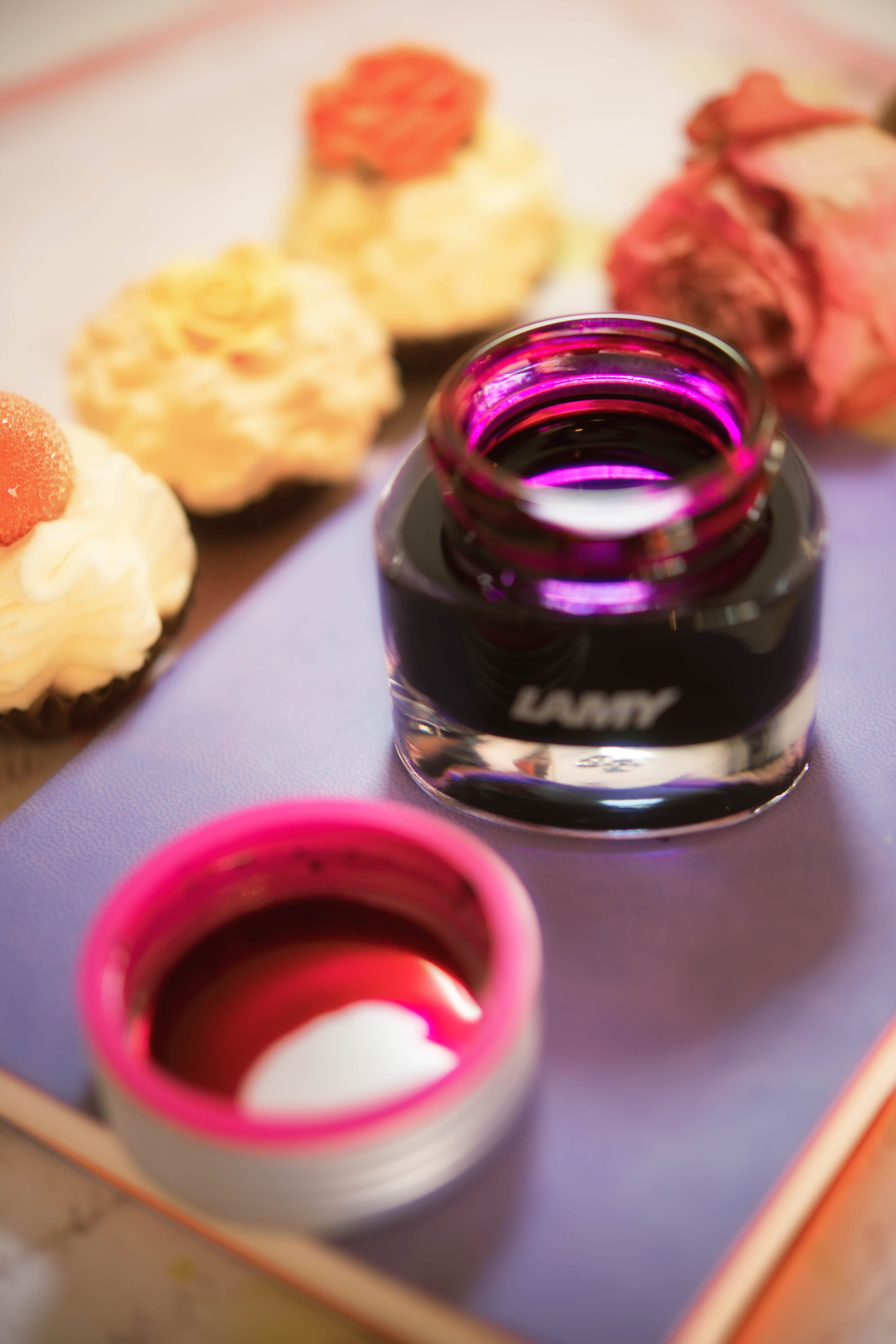
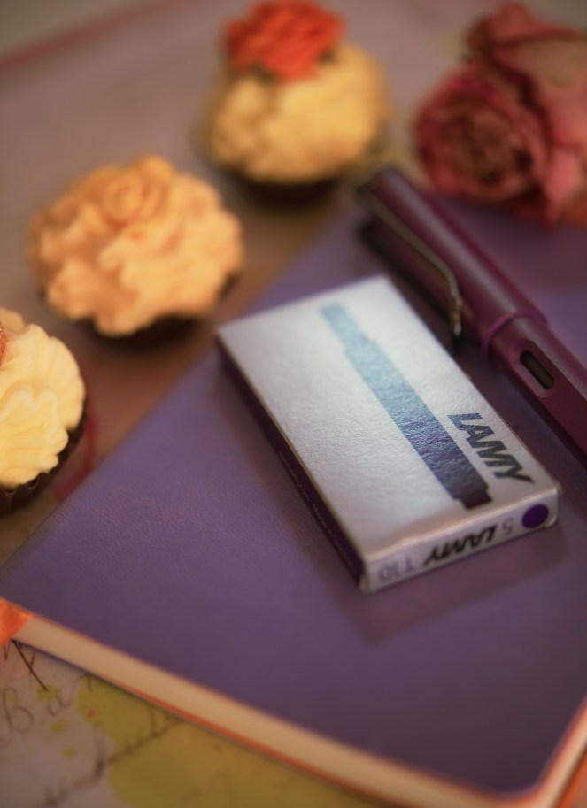
Lamy Beryl
The writing properties are quite good. It is sufficiently wet enough (may be not for a flexy nib). No bleed-through but a significant (but not dramatic) show-through can be ob- served. Drying time is less than around 20 seconds.
The price point is quite reasonable for an ink marketed more on the noble side. 30ml cost 16 US-Dollars, whereas the common inks from Lamy cost about 12US-Dollar (for 50ml though). I actually can’t point out big advantages of the »Crystal« ink in comparison to the common ink. For those who have an eye for esthetic details, will enjoy the ink bottle which reminds me after a container for cosmetic products like a beauty creme. Neither, isn’t the bottle overly pretty … It also actually lacks the more or less useful blotting paper which the common bottles contain! When the bottle gets empty a bigger nib will not dip deep enough into the ink to suck it up sufficiently. The fill height is anyway not very high due to the quite big section.
Conclusion: quite reasonable priced »high-end« ink with good writing properties delivered in a not very handy ink bottle.
Bottle is filled with 30ml ink.
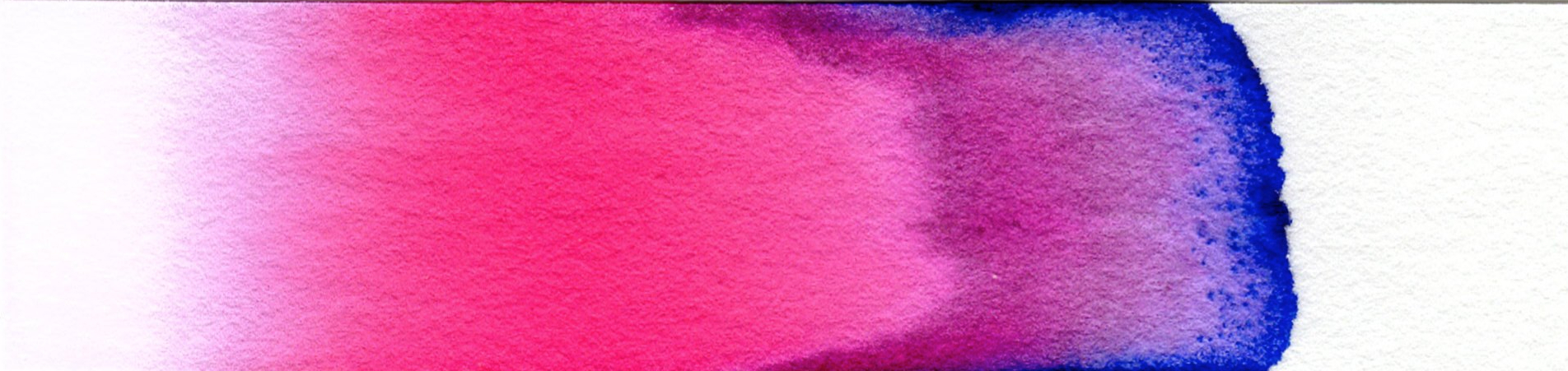
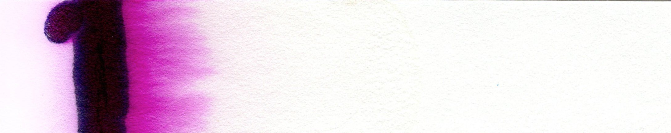
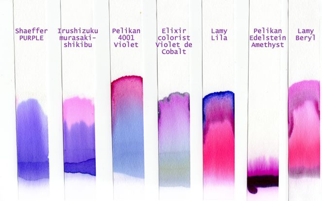
Lamy Beryl is the least purple-ish ink in this review. It is actually very pinkish (on the red side). I added this ink to the blog since it is a quite new ink on the market. It reminds me a bit of the Irushizuku »yama budo« ink. It is quite flashy and vibrant and also quite saturated but provides still a substantial amount of shading.The paper-chromatogram reveals two main colour-shades the ink seems to consist of: a sort of magenta plus a pink part (as well as something greyish remaining at the base of the chromatogram). Actually – at least to my impression – the fresh chromatogram reveal the brighter pink part as a sort of neon-color (or marker color), but that effect cannot be displayed in the scan and has vanished after one day or so.


Lamy lila
This Lamy ink is picked from the common ink range. As far as I know it was marketed together with the »Lamy Safari Lilac« a couple of years ago. Also according to my knowledge the ink was sold ion Europe only in cartridges. Bottled ink was available only in the US (but that is may be just misinformation or has changed now). I actually don’t find it any longer at the Lamy-website. At least the still advertised ink called »violett« is not the same as the one I have (showing no name printed on the box, rather than showing lila/purple coloured borders around the package). I have to admit, I didn’t do any research before I created the images for this blog – and therefore all writing sampels are wrongly labled as »lamy violet« – but it is actually not the violet-version on the market today. However it is a violet or lila or purple ink in terms of its colour. I leave this ink in this blog since some people may still own this ink and can therefore use it as a reference. Sorry for the confusion.
This ink is much more saturated than the »Beryl« ink. Also it is a bit dryer. It still shows a little shading. The chromatogram shows almost the same features as the »Beryl« ink. This ink just consist of darker components and a twist of blue.
For my taste it is a bit too dark but it fits well to the Safari-pen which came out together with the ink.
Remark: to repeat it, the writing samples mislabeling the ink as »violet« which is wrong! »Lamy Violet« is different from the ink reviewed here (»Lamy lila«).

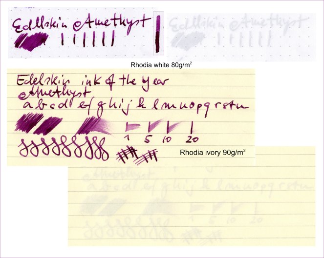
Pelikan Edelstein Amethyst
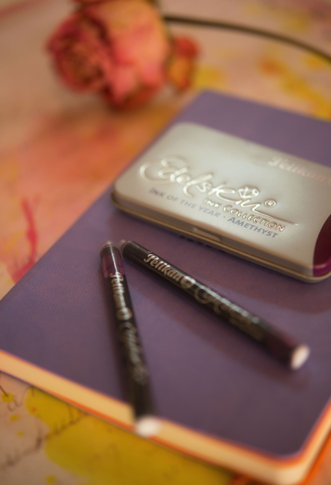
A quite wet ink on the dark side. Highly saturated but still showing shading (less than »Lamy lila«, described before). It consists of a quite water resistant dark component and a quite water soluble magenta part – not very checkered. In total a bit like concentrated drape juice (not wine). I anyway cannot see what’s so special with this »Edelstein« inks. The conventional inks (4001) are in terms of usability (bottles) and quality by no means worse the high-grade ones – at half the price. But of course, the palette of color-shades is huge. The bottles are esthetically absolutely nice. The glass-surface of each bottle is much smoother and more shiny than bottles from other brands. They are real eye-catchers! Unfortunately, they are unsuitable for refilling the pen when the inklevel is low. I only own cartridges, that’s why I cannot show you a bottle.
The ink properties itself are quite ok! No bleed through was observed (on Rhodia paper that is). Shine-through is quite visible, but this is normal for a dark (and saturated ink) like this.
Bottle is filled with 50ml ink.
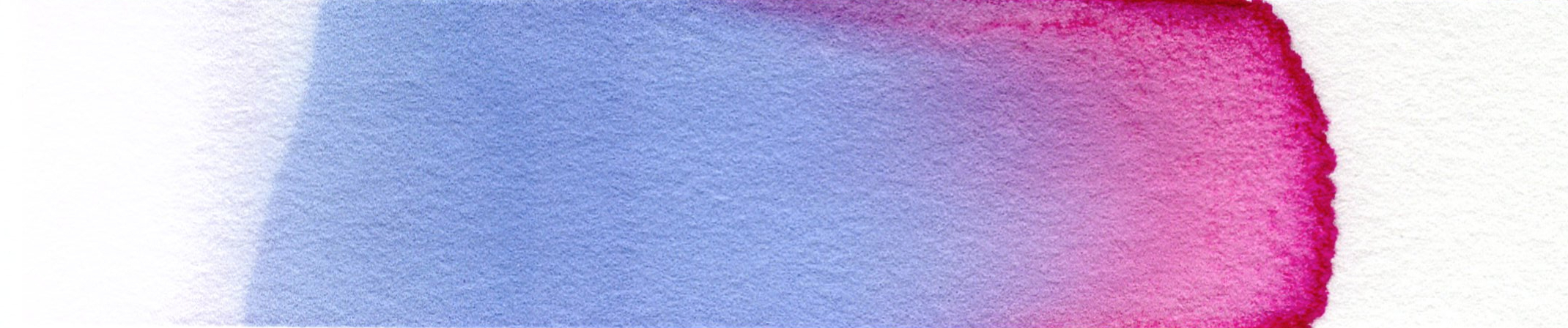
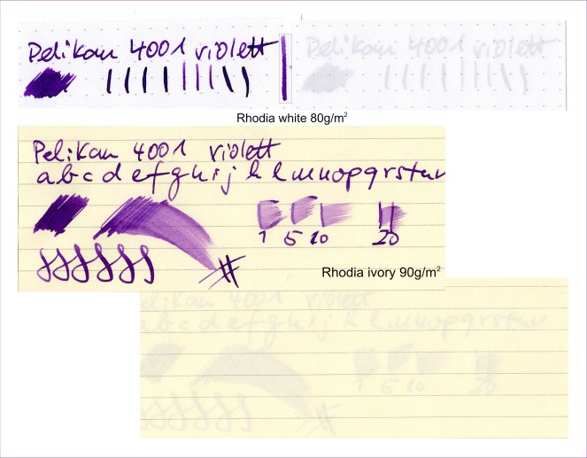
Pelikan 4001 violet
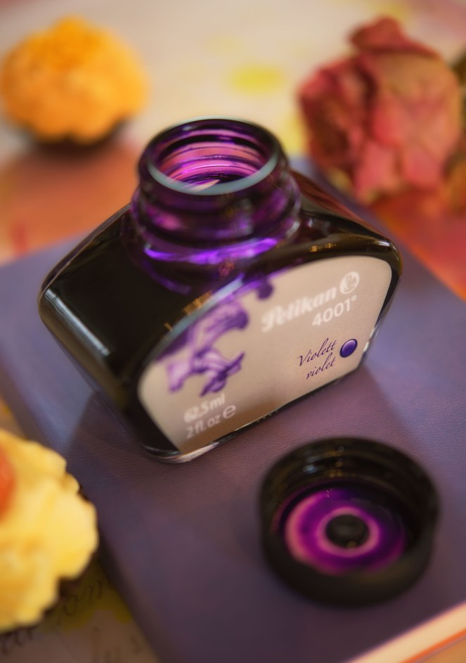
This is a quite dark, rich violet (or purple) with more blue than the abovementioned »Amethyst« from Pelikan. It is brighter than the Lamy lila (also described earlyer). A bit wet and due to saturation showing less shading (at least when used with a gusher of a pen). The shading can be visible, if a dryer nib is used. No complains regarding bleed-through. Show-through is significant as expected but acceptable (for me) and by no means stronger than other darker inks in this review.
The bottled version comes in the typical/traditional Pelikan bottles which can stand on the slanted edge for convenient refilling! Good solution. Otherwise, nothing very special with the bottle. Hold on! It looks nicely old fashioned 🙂
Bottle is filled with 62,5ml ink (30ml flacons with the same shape are available).
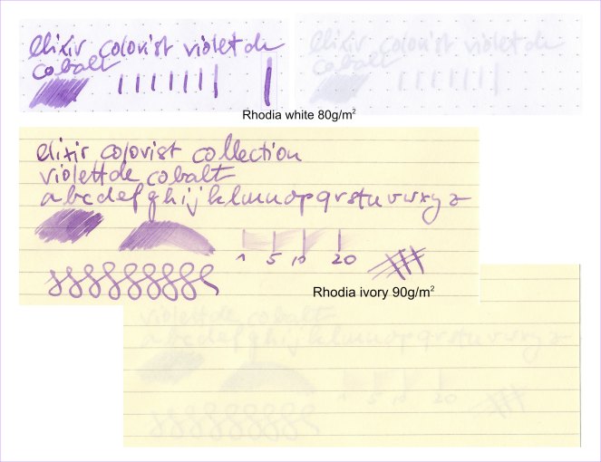
Montblanc Elixir Colorist Collection Violet de Cobalt
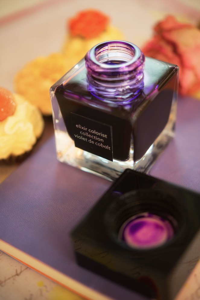
The most ridiculously priced ink ever! »Why did you buy it at all?« could be be your reasonable response. Well, … I wanted to check it. Additionally, the naming is a bit exalted, but that’s just Montblanc.
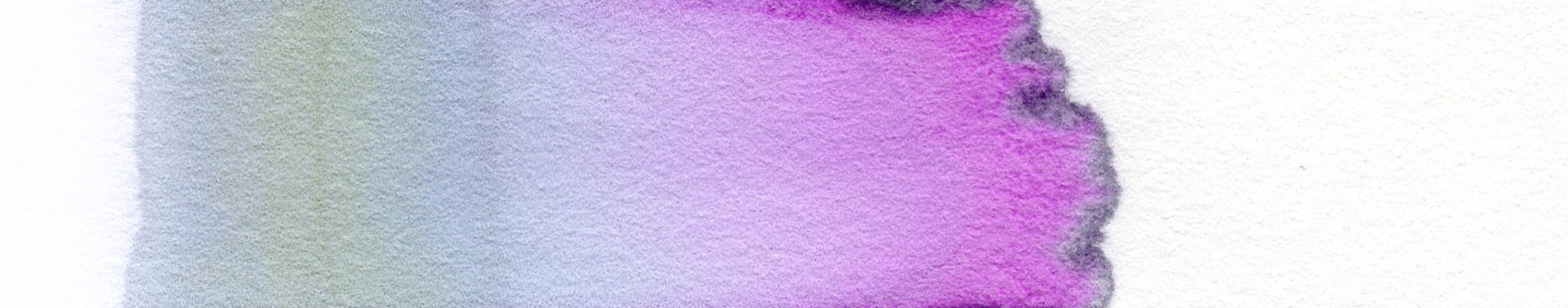
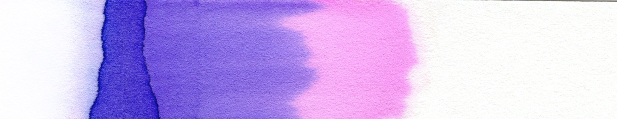
To the ink itself: it is a very pale – not to say diluted – blue-ish purple. But hold on, I like diluted (unsaturated, that is) inks very much. It reveals a quite strong shading which I also like. I don’t understand the association with cobalt, because cobalt is usually blue and not purple. For me the color is more floral like syringa or so. Anyway, doesn’t matter. The properties are very good. It feels quite lubricant which is the only special thing I could find about this ink compared to the others. The least show-through is due to its low saturation.
The chromatogram shows a greenish/greyish insoluble remnant going over in a pale syringa (subjective, I know) coloured band which flows into something pink-ish and ends in a narrow band of a grey-ish something.
The Montblanc webpage says the »permanent colour« was made of natural pigments and mixed with amethyst mineral (why is the ink then not called »amethyst«?). Don’t think the ink is a permanent ink in the sense that it is water insoluble – it is not!
The ink bottle is quite plain (plane walls) and the cap differs from the LE by being not round but squared (in the same horizontal dimensions as the bottle, but vertically slimmer). A merely black sticker tells you what you can find in the bottle (less nice than in case of the Pelikan-Edelstein-series), no drama, either.
Bottle is filled with 50ml ink.
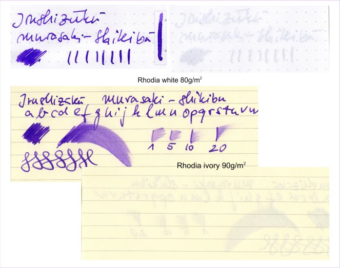
Irushizuku murasaki-shikibu

First a citation (copy/paste) from Wikipedia:
»Murasaki Shikibu (紫 式部, English: Lady Murasaki; c. 973 or 978 – c. 1014 or 1031) was a Japanese novelist, poet and lady-in-waiting at the Imperial court during the Heian period. She is best known as the author of The Tale of Genji, written in Japanese between about 1000 and 1012. Murasaki Shikibu is a descriptive name; her personal name is unknown, but she may have been Fujiwara no Kaoruko (藤原 香子), who was mentioned in a 1007 court diary as an imperial lady-in-waiting«. The German Wiki says also the term »murasaki shikibu« means »ceremonial violet«.
Yes, it is a real purple (or for my part, purple)! With a shot of blue into it. Quite similar to the Shaeffer purple – but more vibrant. In comparison to Pelikan violet it is less saturated leaving more room for shading. The chromatogram reveals three distinct areas: the purple base with the unsouble remnants, a pale, diluted purple followed by a pale pink colour band. Like all other shown inks in this blog it has nice properties (no bleed through and not too strong shiw-through, that is).
Also this ink feels quite lubricant. It dries quite slowly (after more than 20 seconds).
The bottle is quite well known in the fountain pen world and looks like a parfume flacon. A little cavity in the bottom of the bottle allows a deeper position of the nib/feed and allows ink uptake when the ink level is quite low. Don’t expect wonders here, though. A slanted position of the flacon helps much more. But a neat idea, anyway!
Bottle is filled with 50ml ink.
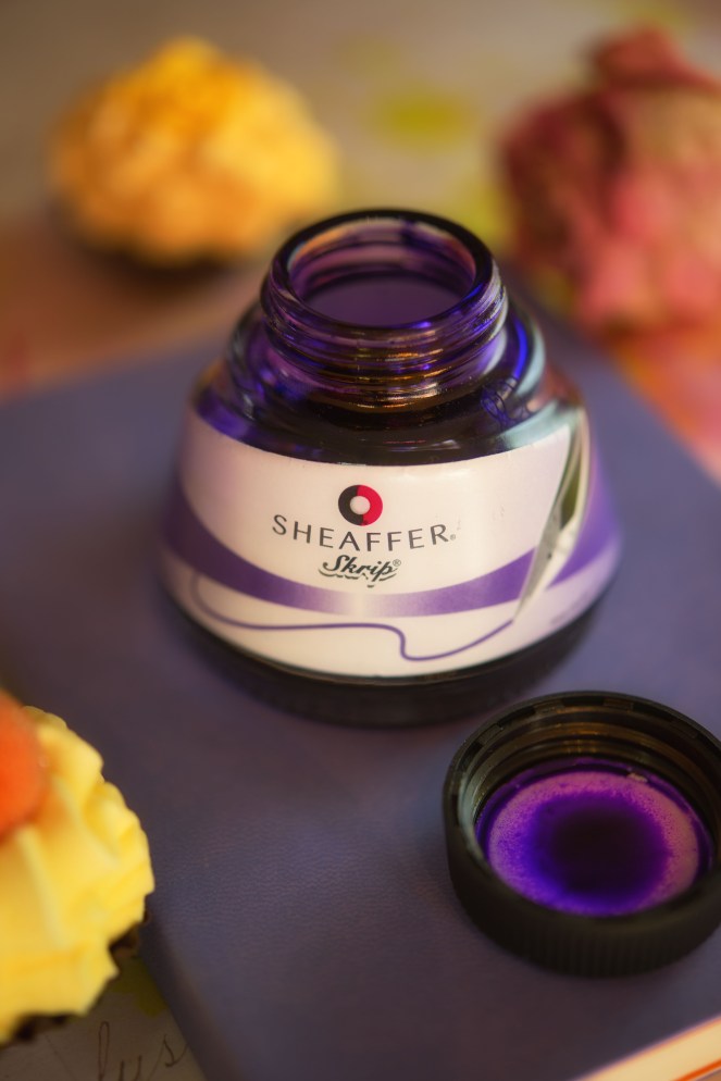
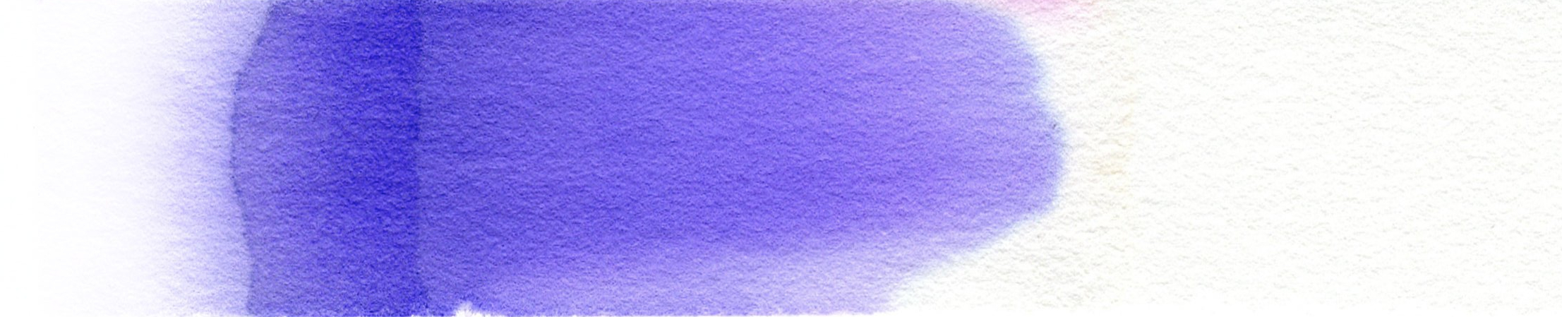
Sheaffer purple
Reminds mostly of the Irushizuku ink. It is just less vibrant and shows may be a tad more red? Unfortunately, the chromatogram reveals nothing in this respect. It is a plain purple coloured fluid, nothing more. Also, this ink is dryer than the »murasaki shikibu«.
Sounds so boring, but also here I have no complains with respect to bleed-through and show-through. The ink is just doing what can be expected from a proper fountain pen ink.
Bottle is filled with 50ml ink.
Remark: the writing samples are wrongly labeled with »Shaeffer« instead of »Sheaffer«. I beg your pardon …
Comparisons


Leave a comment