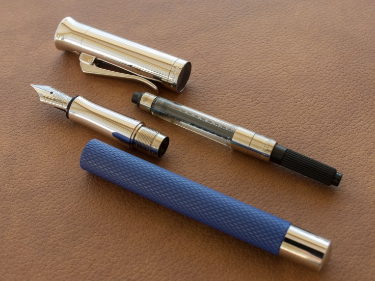
This blog deals with two fountain pens in my collection. The
Graf von Faber-Castell Classic Anello and
GvF-C Guilloche
Both pens represent the middle (Guilloche) and the middle to high level (Anello) pens of this brand. The Tamito is below and the Classic (without ›Anello‹) and the Intuition are the top range. Additionally, there are limited editions.
The pens look basically the same, they differ by section, barrel material and the complexity of the caps. The spring loaded and very good to use clips are identical. The caps, in turn, are the most unique feature of the Graf von Faber-Castell pens compared to other brands. They are of metal with an extreme shiny finisch. They show a special shape, which gets broader toward the finnial. They look a bit like a wind instrument (may be a clarinet).


In summary, the Classic Anello and the Guilloche are quite slender and (as always in the eye of the beholder) very elegant. The metal cap results in a bottom heavy weight balance. But of course only if closed. With a posted cap they get top heavy. This pen is anyway not completely postable. The cap holds secure, though.
Both pens are cartridge/converter pens – like the other fountain pens produced by this vendor (some LE or ›Pen of the Year‹ are may be piston fillers, but I am not sure). So the basic construction is a metal section, a plastic or wooden barrel and the already mentioned metal cap (Figure 1 and 2). The endpart of the barrel is also of metal. But the higher range pen (Anello) as the cap also this part has a little step. Both are manufactured and decorated with tiny glyphs (see figures). The higher ranged Classic Annello has a screwable cap, whereas the Guilloche is more simple just to clip on.
The nib of both pens is 18kt gold, handmade. The Guilloche is unicolour, rhodinated. The Anello has a bicolor nib. Both are in the same size and imprinted identically. The size is number 5 (I would estimate so – in any case smaller than a Pelikan M800-nib or a Montblanc 146-nib which are number 6). The plastic feeds are also identically.
The nibs are available in extra fine, fine, medium and broad (as well as the slanted tip-cuts oblique medium and broad). I cannot emphasize these options enough, because some vendors cut oblique nibs from their program (Pelikan).
The Graf von Faber-Castell luxury pens differ from other (luxury) pens mainly in three characteristics: (a) they are almost exclusively cartridge/converter pens, (b) metal caps (c) options of wooden barrels (Classic and Classic Anello). By the way, the difference between the Classic Anello and the pure Classic is subtle: both are wooden, but the Anello is segmented with shiny rings (that is where the name ‘Anello’ is from). The Classic is more expansive than the Anello, may be due to the fact, that the barrel is of one peace in contrast to the Anello.
On the webpage of GvFC you find a bunch of color-options as well of guilloche-Types for the Guilloche.
These pens are undoubted luxury pens, but somehow, when you see them disjointed in their parts (section, converter and barrel) the do not look any longer so exclusively and luxuriously. In particular the Guilloche. Yes, the parts are built in high quality. Especially, the cap is built flawlessly. When mounted and in hand as well when writing they get mostly back their charme. On the desk and capped they look fabulous.
One little functional flaw I have with the Anello: when screwing the cap (to open the pen), the barrel also turns a fourth turn. Not very annoying but not good, either.
The writing experience is for both pens quite good. The nibs are typical modern types, not too stiff and not soft, either. I don’t see a big difference to the Pelikan nibs or those from Montblanc. The oblique nibs (I have them in OM and OB) show a slightly stubbish character which I welcome. The broad nib with the stronger effect than the medium nib – quite reasonable. The nibs are good performers, I observed no skipping at all (at least I can judge from my pens). Whether they feel smooth or stuff like that can only be subjective, hence I abstain from a judgement here.
Take in mind, the pens described here are quite thin – much thinner than a M800 or a Platinum Century 3776. Also the metal section can feel slippery. Actually, my fingers never slipped but in case of slightly sweated fingers the feeling is quite odd.

Would I buy those pens again, or another one fram this brand? Well, the Guilloche I could dispense mostly. I could be interested in the Intuition because it seems to be more girthy and it lacks the metal section. The bicolor-nib (which is bigger at least judged from the pictures in the internet) looks quite interesting.
Writing samples

Some Pictures


Leave a comment